ABOUT—
ABOUT—
Under The Sunlight is a mindful stationery brand, creating beautifully crafted products that serve as a blueprint for purposeful living.
Under The Sunlight is a mindful stationery brand, creating beautifully crafted products that serve as a blueprint for purposeful living.
Under The Sunlight is a mindful stationery brand, creating beautifully crafted products that serve as a blueprint for purposeful living.
Under The Sunlight is a mindful stationery brand, creating beautifully crafted products that serve as a blueprint for purposeful living.
Under The Sunlight is a mindful stationery brand, creating beautifully crafted products that serve as a blueprint for purposeful living.
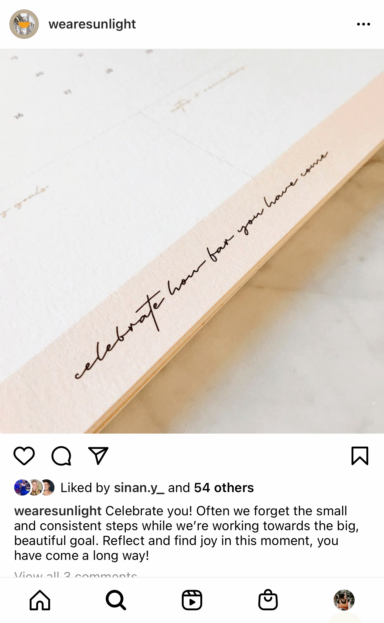
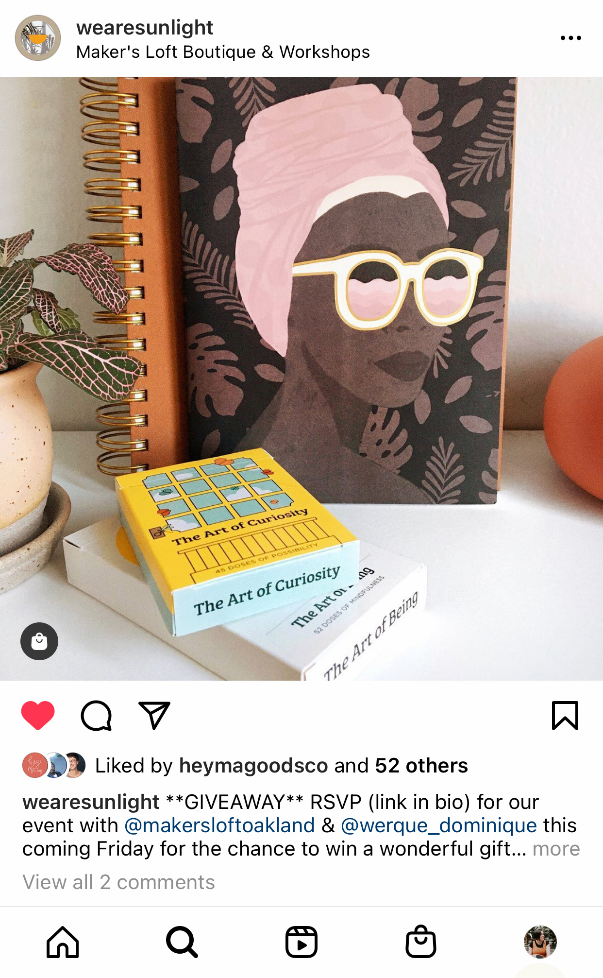
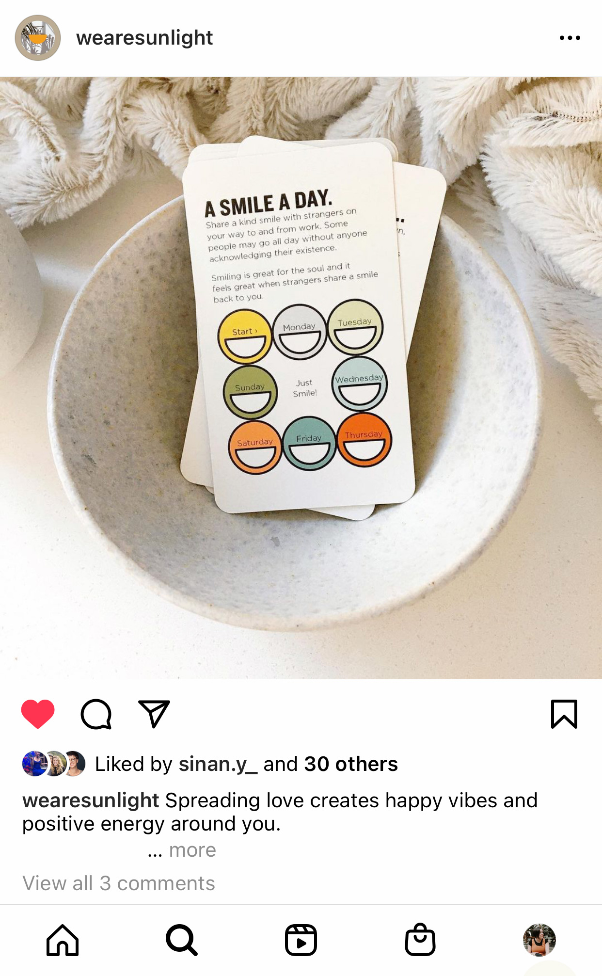
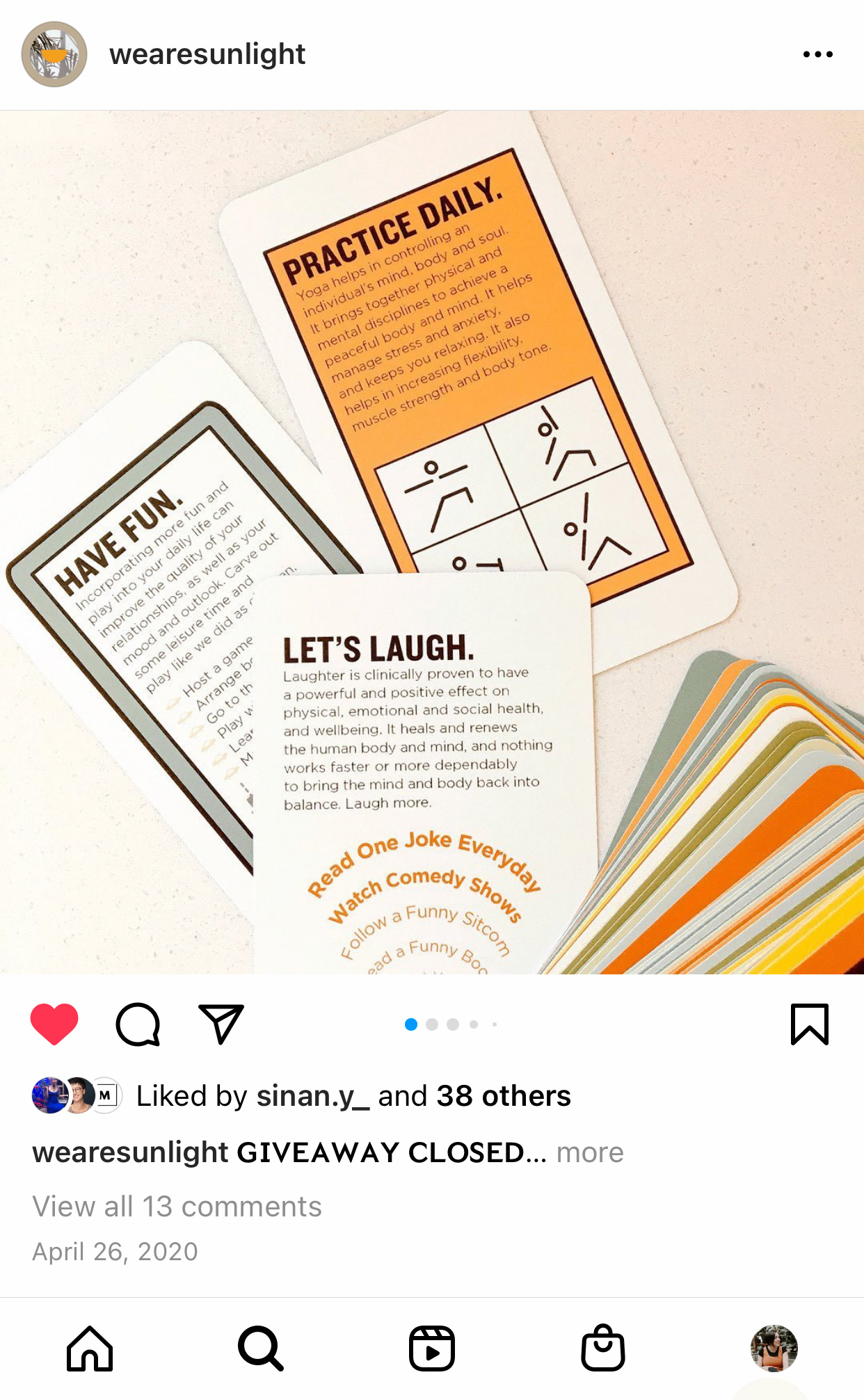
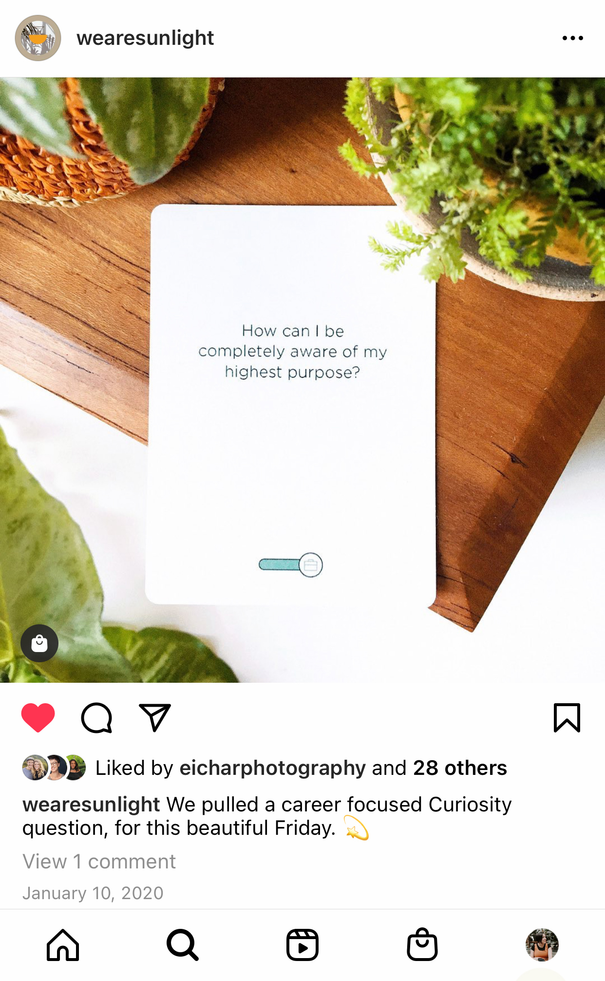
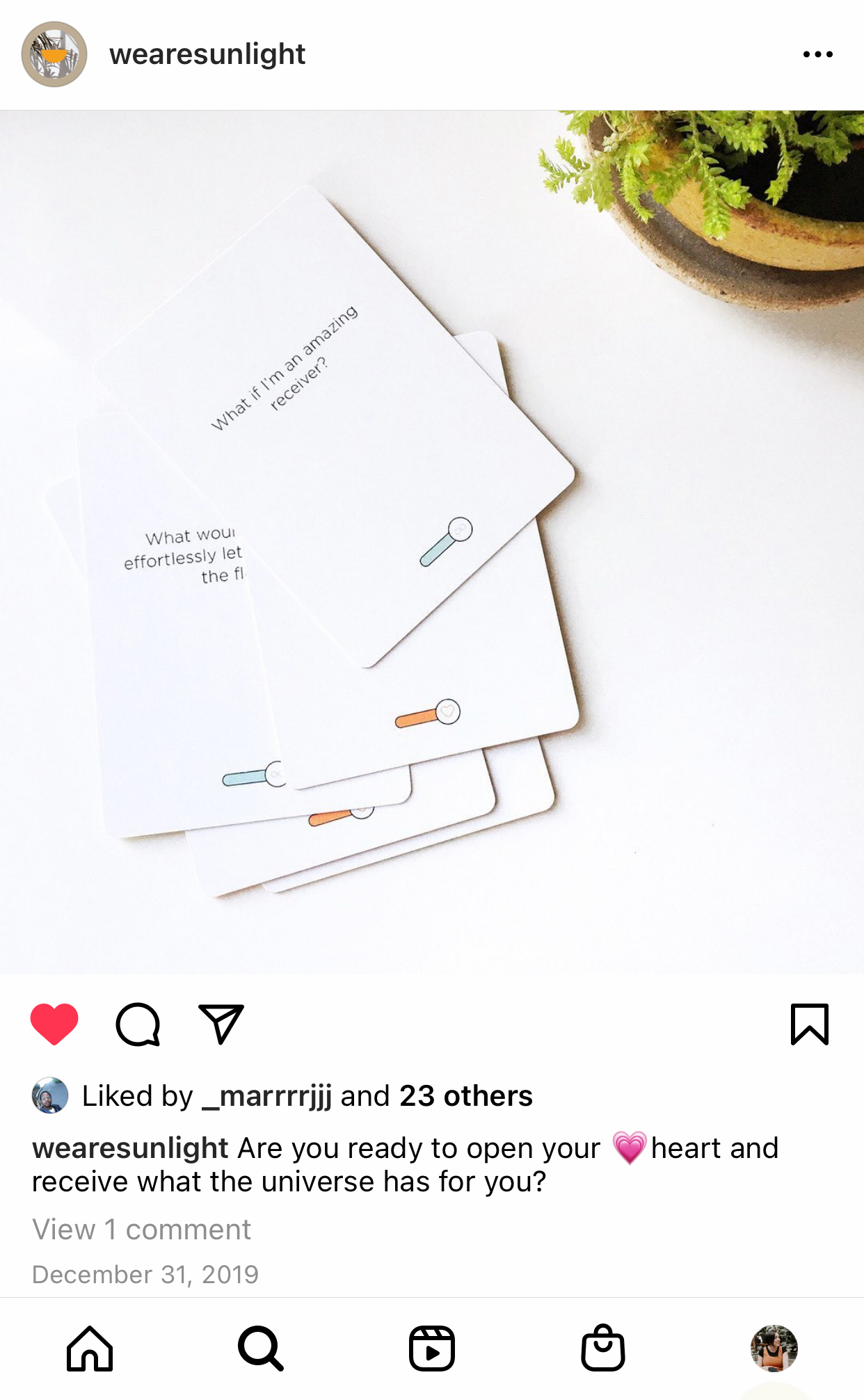
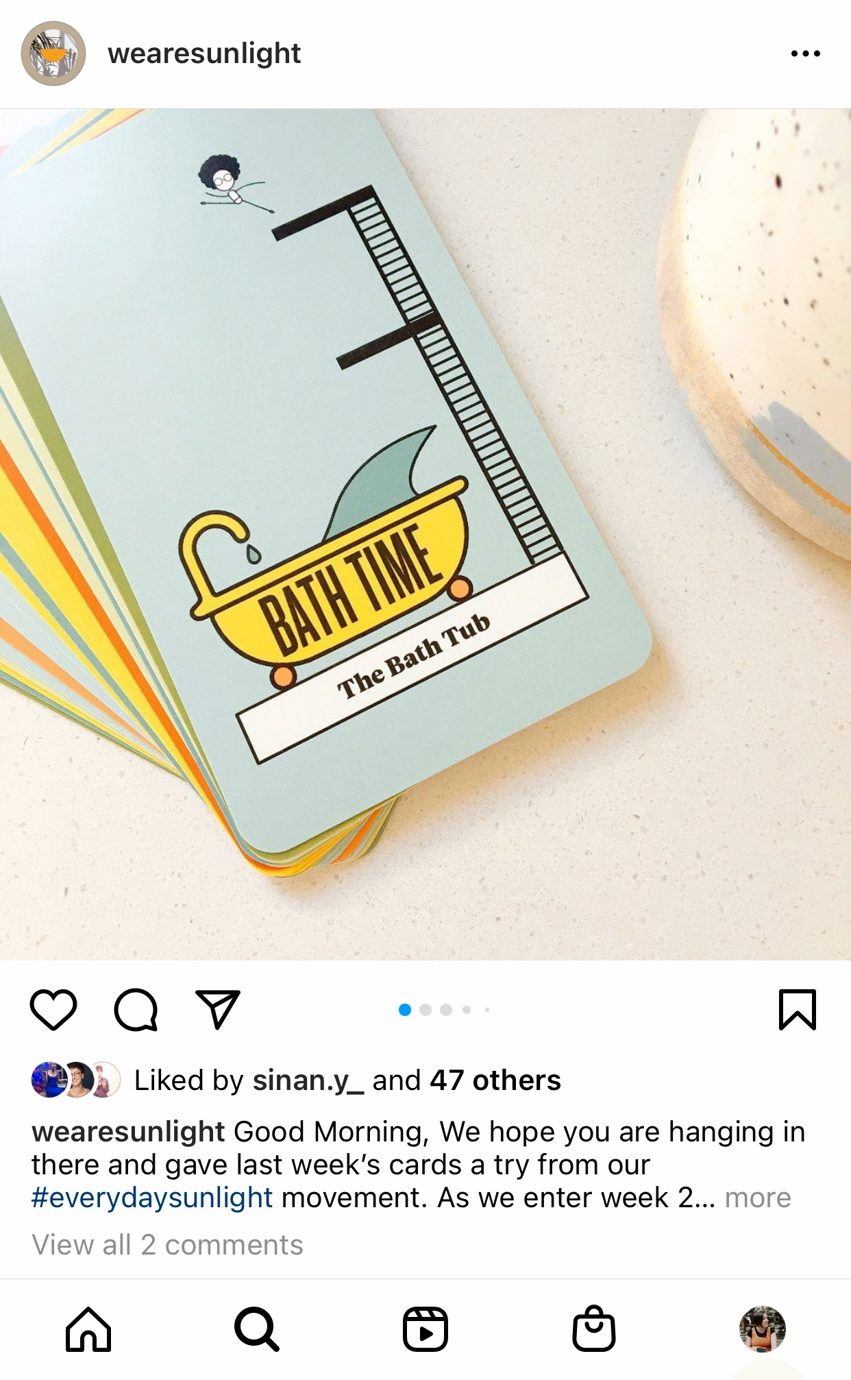
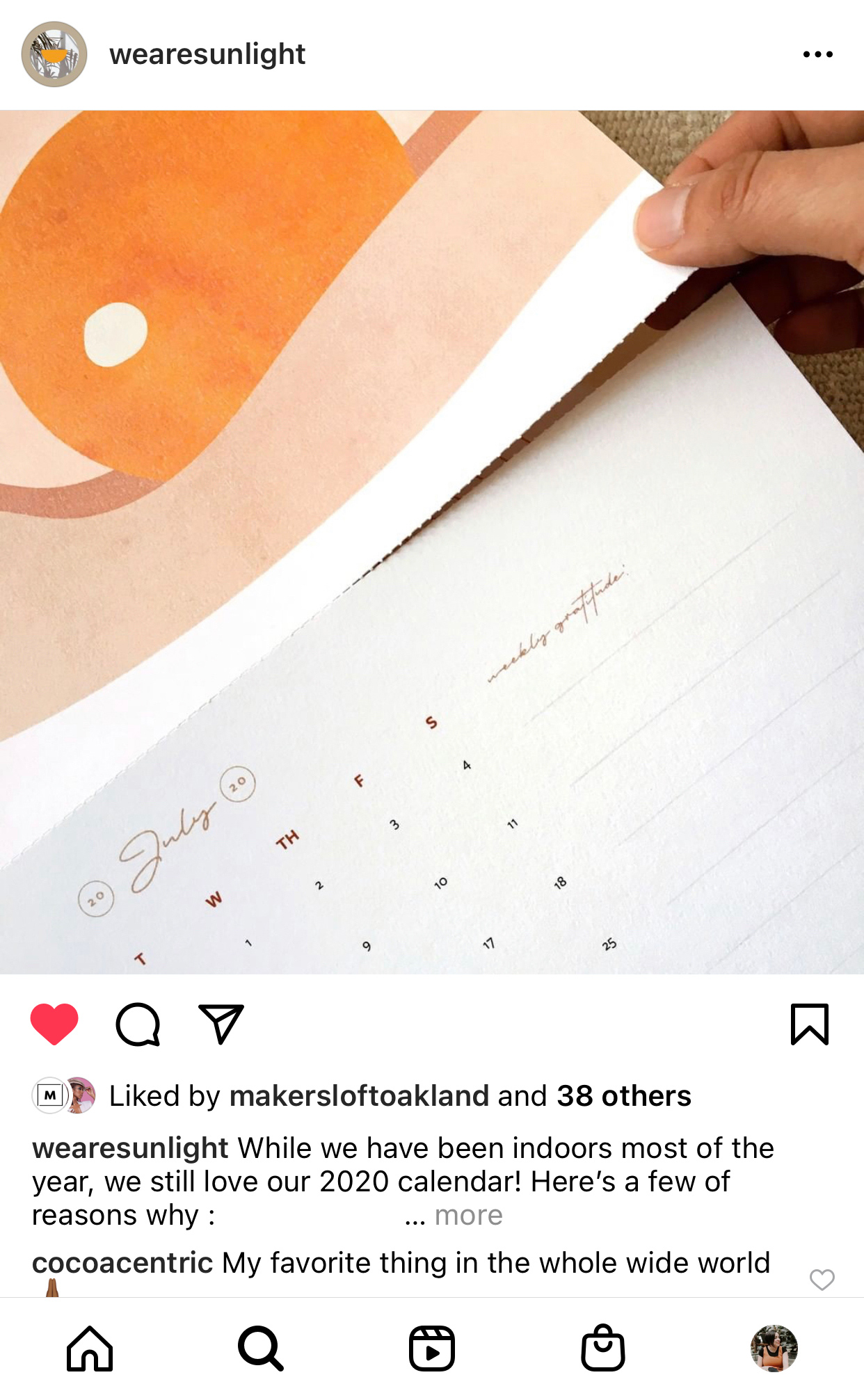
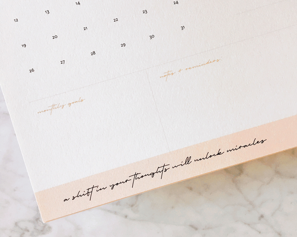
Sinan Franklin launched the Art of Being card deck in 2018 to inspire others in embracing joy, self-compassion and curiosity. Through local pop-ups, the card decks took off and inspired the creation of other paper products that encourage mindful practices of self-care and purposeful living.
Sinan had a big vision in mind—to create a wellness-focused stationery brand representing people of color and offering tools that empower women to take care of themselves—physically, mentally, spiritually. Under the Sunlight is more than just a brand offering physical products that make you feel good. It's a brand that values connection, community, self-worthiness, and self-alignment; one that encourages self-discovery and joy. It's about believing that you deserve happiness and success as everyone else—there's enough for all of us to have that.
—
To embody this concept, we started with brand strategy to uncover how the brand needed to look, feel and sound, and what kind of experience we wanted the customers to have.
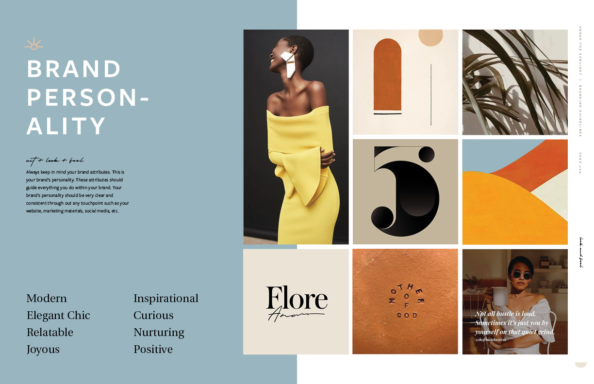
Two common problems of brands in the paper goods industry are either high-end and unreachable, or cheap and forgettable—so, a big challenge was to create a stationery brand that embodied both quality and accessibility. A blend of elegance and playfulness that nurtures curiosity and warmth, the perfect feel that will emotionally connect with UTS' ideal clients: people who know that happiness is the key to achieve the life they want, who long for a new positive way of seeing themselves in the world.
Two common problems of brands in the paper goods industry are either high-end and unreachable, or cheap and forgettable—so, a big challenge was to create a stationery brand that embodied both quality and accessibility. A blend of elegance and playfulness that nurtures curiosity and warmth, the perfect feel that will emotionally connect with UTS' ideal clients: people who know that happiness is the key to achieve the life they want, who long for a new positive way of seeing themselves in the world.
Two common problems of brands in the paper goods industry are either high-end and unreachable, or cheap and forgettable—so, a big challenge was to create a stationery brand that embodied both quality and accessibility. A blend of elegance and playfulness that nurtures curiosity and warmth, the perfect feel that will emotionally connect with UTS' ideal clients: people who know that happiness is the key to achieve the life they want, who long for a new positive way of seeing themselves in the world.
Two common problems of brands in the paper goods industry are either high-end and unreachable, or cheap and forgettable—so, a big challenge was to create a stationery brand that embodied both quality and accessibility. A blend of elegance and playfulness that nurtures curiosity and warmth, the perfect feel that will emotionally connect with UTS' ideal clients: people who know that happiness is the key to achieve the life they want, who long for a new positive way of seeing themselves in the world.
Two common problems of brands in the paper goods industry are either high-end and unreachable, or cheap and forgettable—so, a big challenge was to create a stationery brand that embodied both quality and accessibility. A blend of elegance and playfulness that nurtures curiosity and warmth, the perfect feel that will emotionally connect with UTS' ideal clients: people who know that happiness is the key to achieve the life they want, who long for a new positive way of seeing themselves in the world.
THE
IDENTITY—
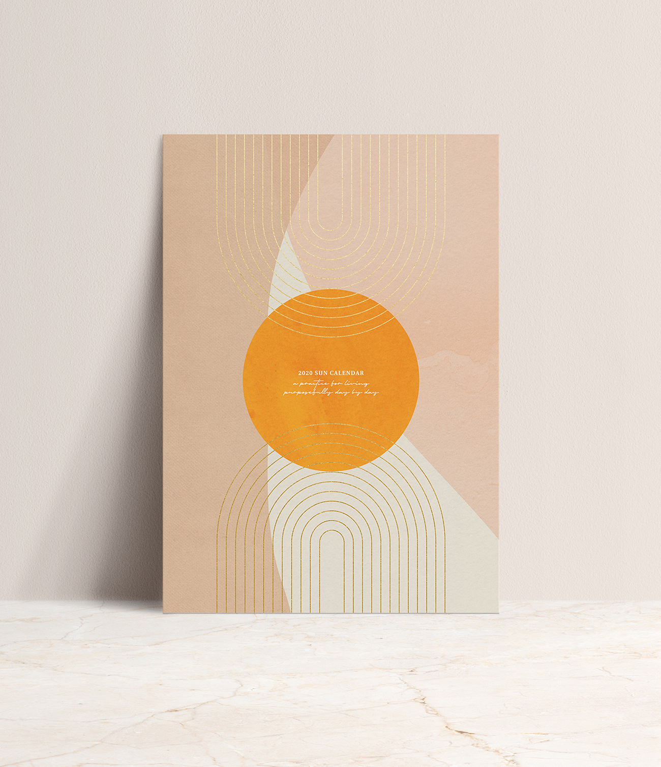
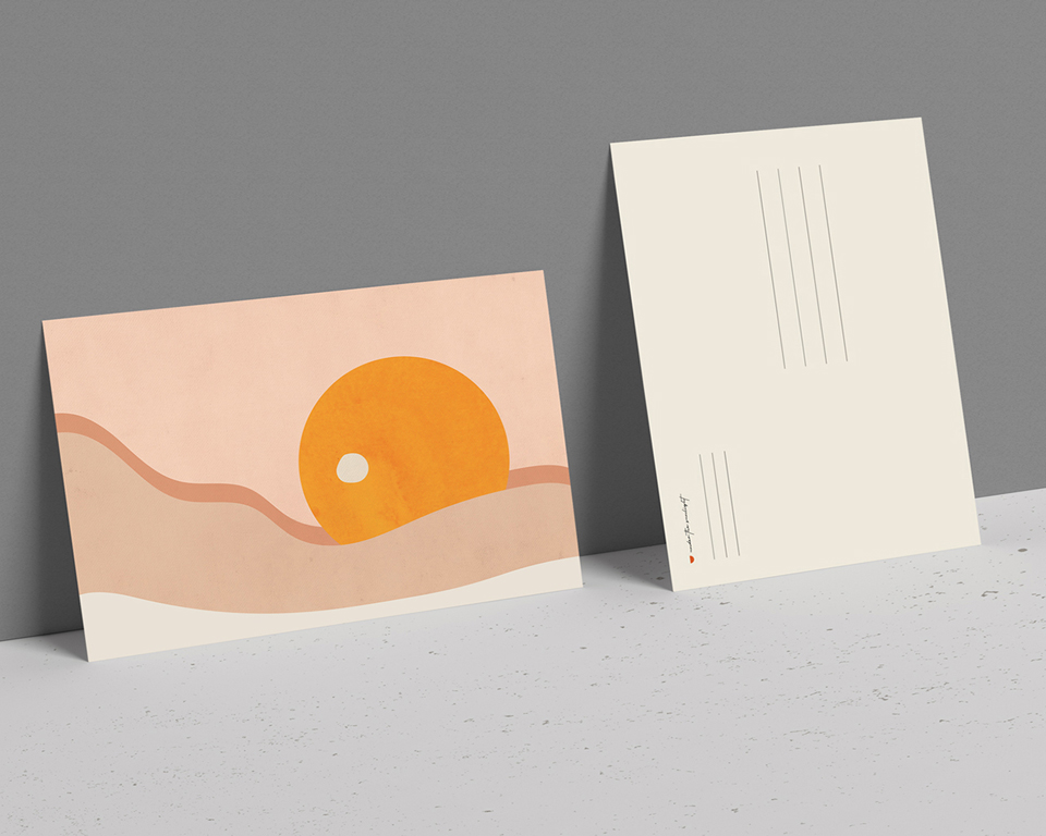
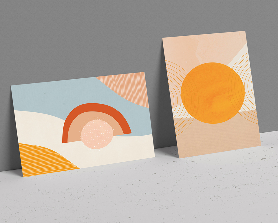
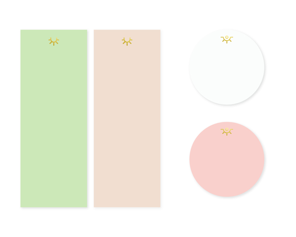
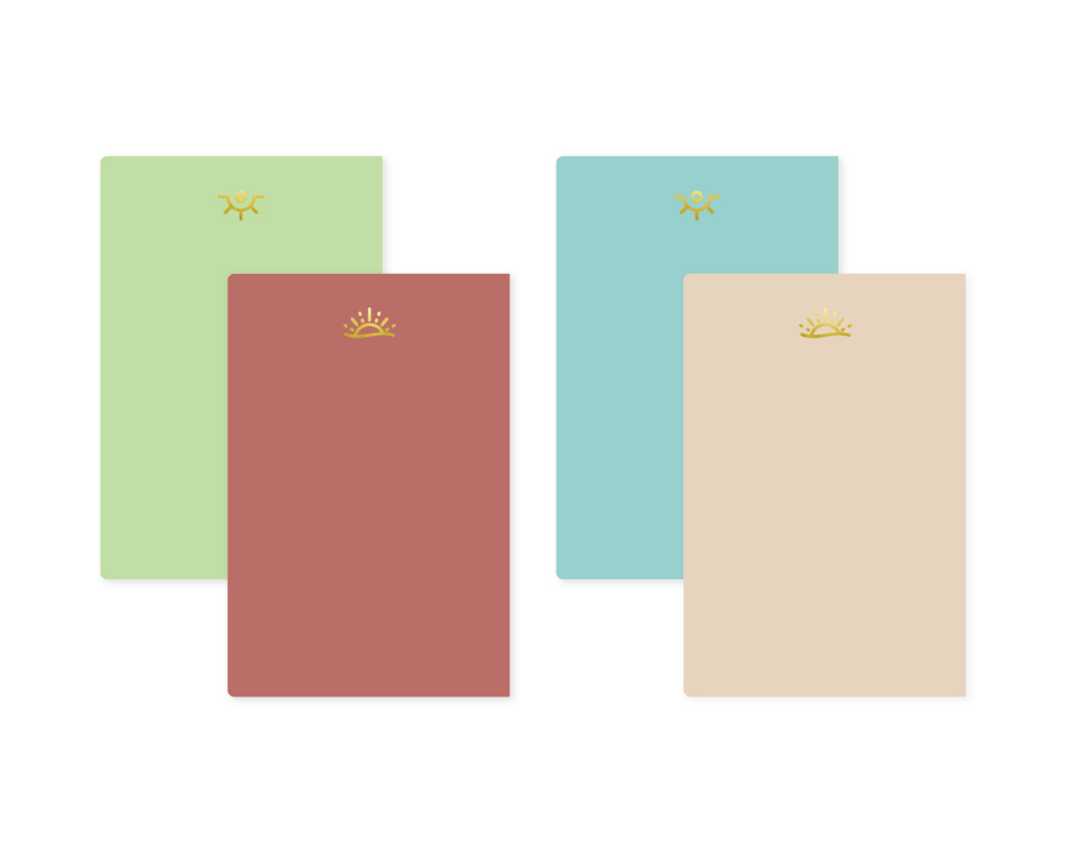
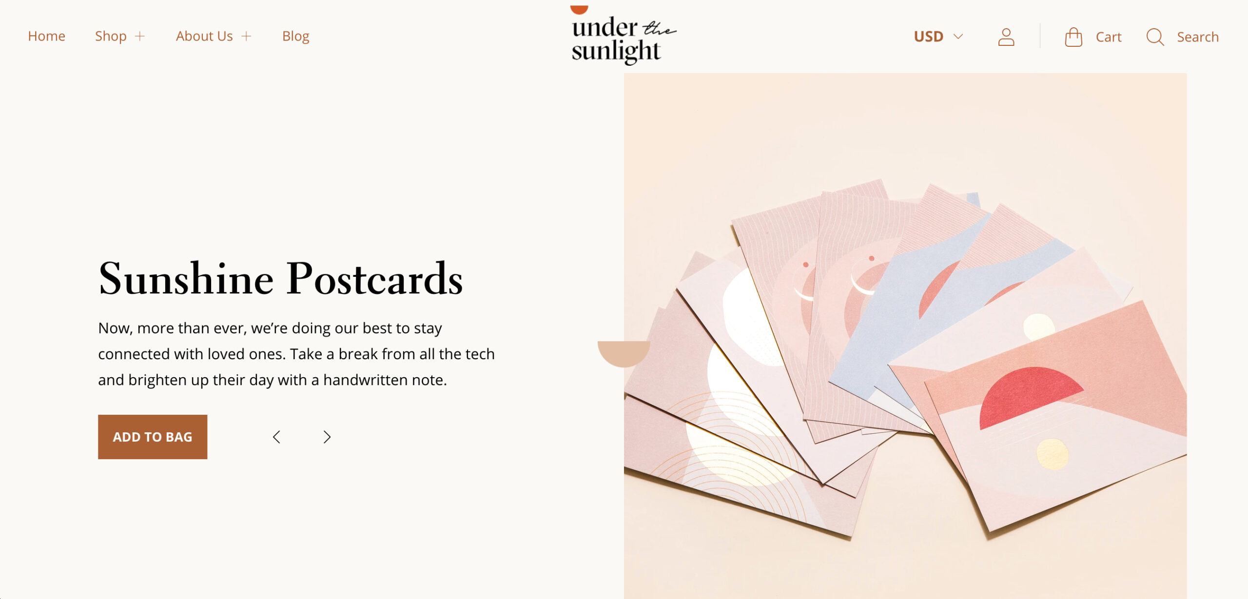
Under The Sunlight's identity piece is made of a semi circle sun that is positioned above a wordmark, literally illustrating being under the sunlight. The serif typeface brings in the boldness that balances the personal feel of the script typeface. The brand brings a touch of relatability through a warm and modern color palette and playful visual elements derived from the original sun symbol. These individual elements work together to bring more personality and energy to the visual identity of the brand, speaking to the concept of finding our individual joy and seeking possibility through curiosity.
Under The Sunlight's identity piece is made of a semi circle sun that is positioned above a wordmark, literally illustrating being under the sunlight. The serif typeface brings in the boldness that balances the personal feel of the script typeface. The brand brings a touch of relatability through a warm and modern color palette and playful visual elements derived from the original sun symbol. These individual elements work together to bring more personality and energy to the visual identity of the brand, speaking to the concept of finding our individual joy and seeking possibility through curiosity.
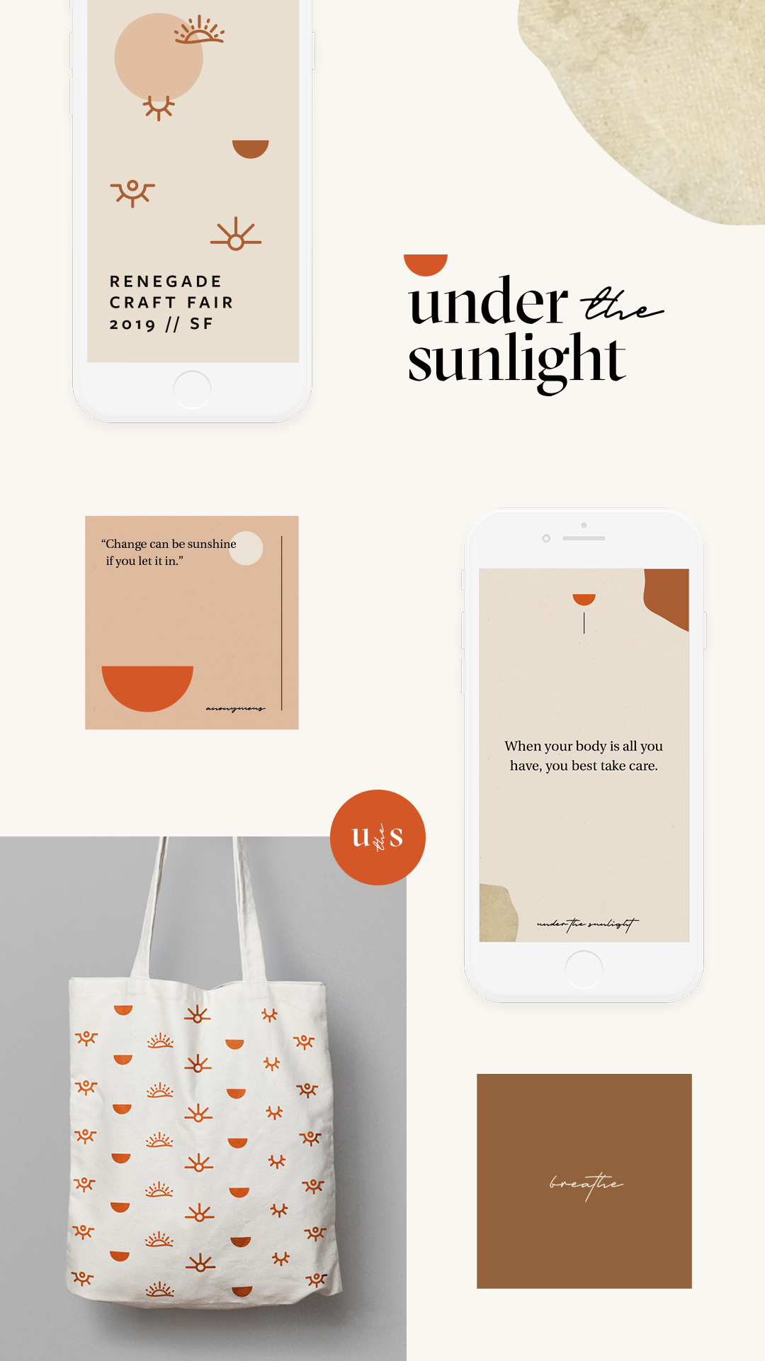
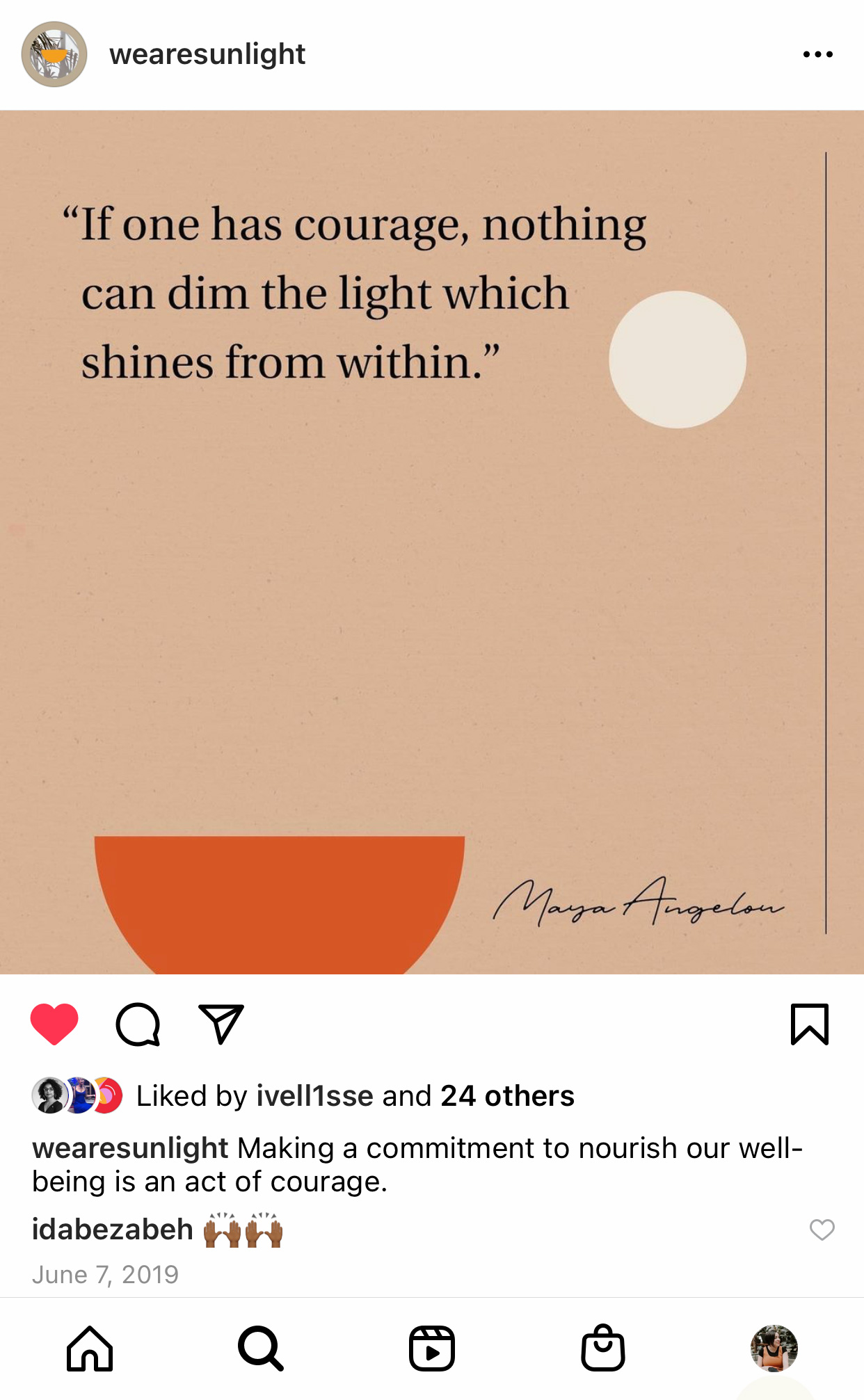
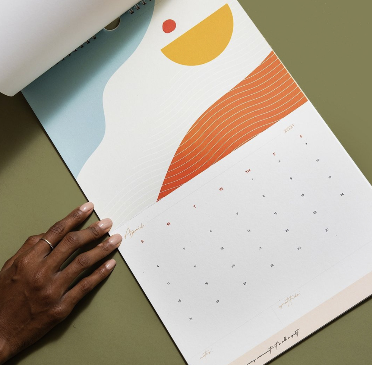
With a refined brand strategy, Under The Sunlight was able to build a visual identity and create a social presence. The brand experience is now aligned and intentional across different platforms and touch points—from print and product designs, to social media and website. This collaboration has helped bring Sinan's vision come to life, giving her a brand look and voice she can use to champion her cause as she continues to create mindful stationery products that encourage all of us to honor our well-being by choosing to bring more joy and embrace possibility in our lives.
With a refined brand strategy, Under The Sunlight was able to build a visual identity and create a social presence. The brand experience is now aligned and intentional across different platforms and touch points—from print and product designs, to social media and website. This collaboration has helped bring Sinan's vision come to life, giving her a brand look and voice she can use to champion her cause as she continues to create mindful stationery products that encourage all of us to honor our well-being by choosing to bring more joy and embrace possibility in our lives.

“
”
20
19
CLIENT TESTIMONIAL
Sinan Zawde /
Under the Sunlight
My goal was to build a strong foundation for my brand and now I have a brand voice.
I knew Donají understood my vision for the brand. I gained so much by working with her. What made me happiest about the project was seeing the logo and just her joy with the project too. She is amazing, talented and very professional! She was great at every part of the process and with what was needed, even if I couldn’t see it was needed at first.
OAK
CA
Ready to transform YOUR business?
Get in Touch
Get in Touch
Get in Touch
Get in Touch
Get in Touch
Branding for established women of color entrepreneurs and BIPOC-led organizations wanting to unapologetically stand out and clearly amplify their message.
Branding for established women of color entrepreneurs and BIPOC-led organizations wanting to unapologetically stand out and clearly amplify their message.
Branding for established women of color entrepreneurs and BIPOC-led organizations wanting to unapologetically stand out and clearly amplify their message.
Branding for established women of color entrepreneurs and BIPOC-led organizations wanting to unapologetically stand out and clearly amplify their message.
©Donaji Mejia 2024 | Privacy Policy | Terms
©Donaji Mejia 2023 | Privacy Policy | Terms
©Donaji Mejia 2023 | Privacy Policy | Terms

EST 2016 - CA
EST 2016 - CA
EST 2016 - CA