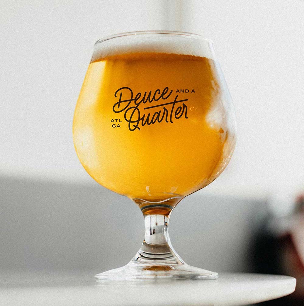
A taproom celebrating craft beer, cummunity, culture, and education in ATL.
SERVICES /
Brand Strategy
Branding Design
Web Design
Collateral
ABOUT /
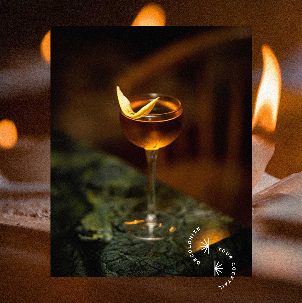
Black-Owned
Atlanta, GA

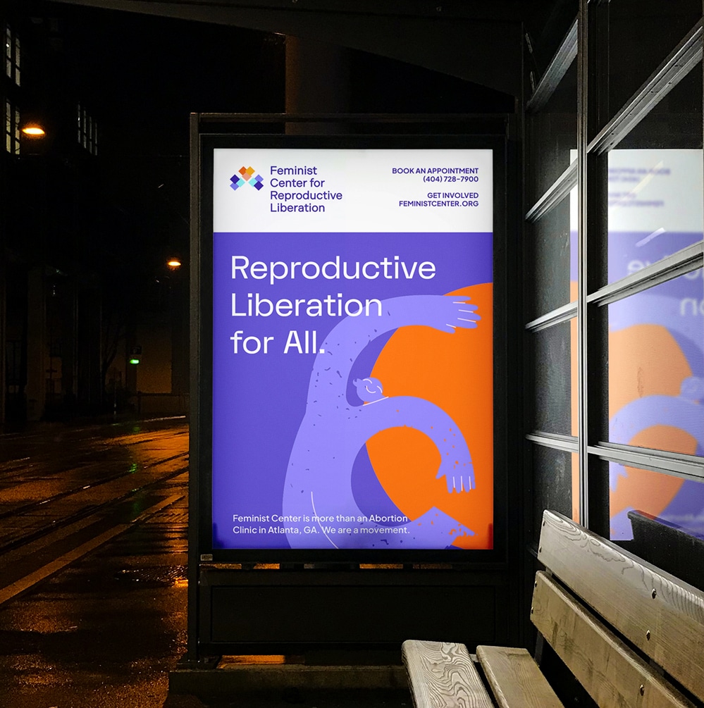
OVERVIEW /
Deuce and a Quarter began as a casual way for founder Darren Armstrong to connect with friends over craft beer. As interest grew, so did Darren’s vision—to create a space that centered community, celebrated culture, and amplified Black and Brown voices in Atlanta’s craft beer scene.
He set out to build a brand that not only reflected his values but also invited deeper engagement from the local community.

CHALLENGE /
In a saturated market, Deuce needed to stand out—not just as another craft beer space, but as a culturally-rooted, welcoming space where people of color could see themselves, feel safe, learn about craft beer, and connect as a community.
Darren had the vision but needed help articulating it clearly to customers, community partners, and future investors.
APPROACH /
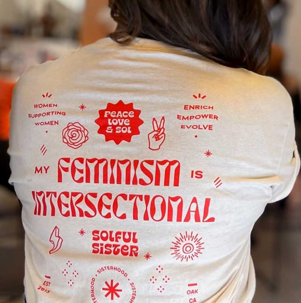
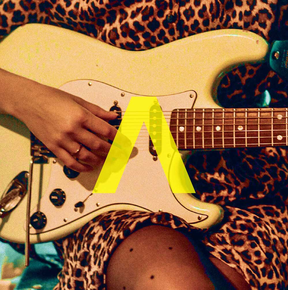
Our mission was to bring clarity to the brand and design a visual identity that captured Deuce’s cultural depth and community spirit. We rooted the strategy in one core idea: community is the product.
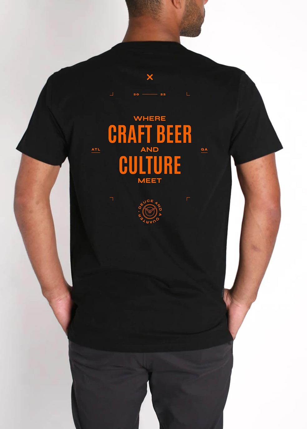
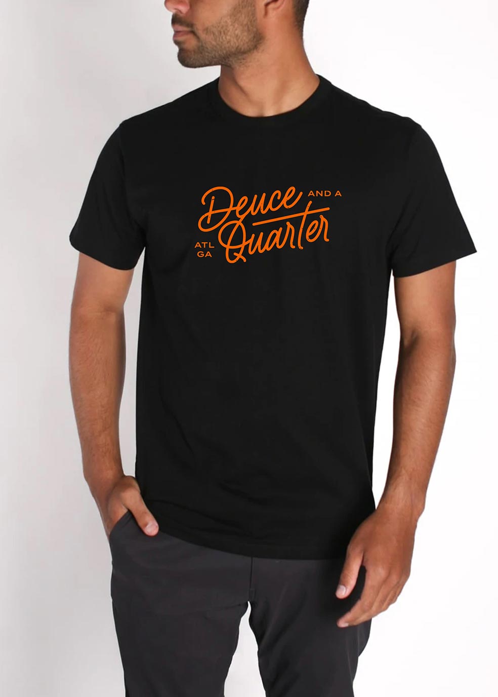
We crafted a brand experience that reflects the energy of Deuce’s events—where connection, education, and flavor collide. Inspired by Darren’s heritage, the name pays homage to his grandfather’s 1950s Buick Electra 225, a nod carried through in retro car-inspired logos and iconography.
The result—a visual identity that fuses nostalgia with modern urban aesthetics—hip-hop, fun, and unmistakably familiar to the audience it’s meant for.
Our mission was to bring clarity to the brand and design a visual identity that captured Deuce’s cultural depth and community spirit. We rooted the strategy in one core idea: community is the product.
We crafted a brand experience that reflects the energy of Deuce’s events—where connection, education, and flavor collide. Inspired by Darren’s heritage, the name pays homage to his grandfather’s 1950s Buick Electra 225, a nod carried through in retro car-inspired logos and iconography.
The result—a visual identity that fuses nostalgia with modern urban aesthetics—hip-hop, fun, and unmistakably familiar to the audience it’s meant for.

◆
Welcome ATLIEN beer nerds and the curious.
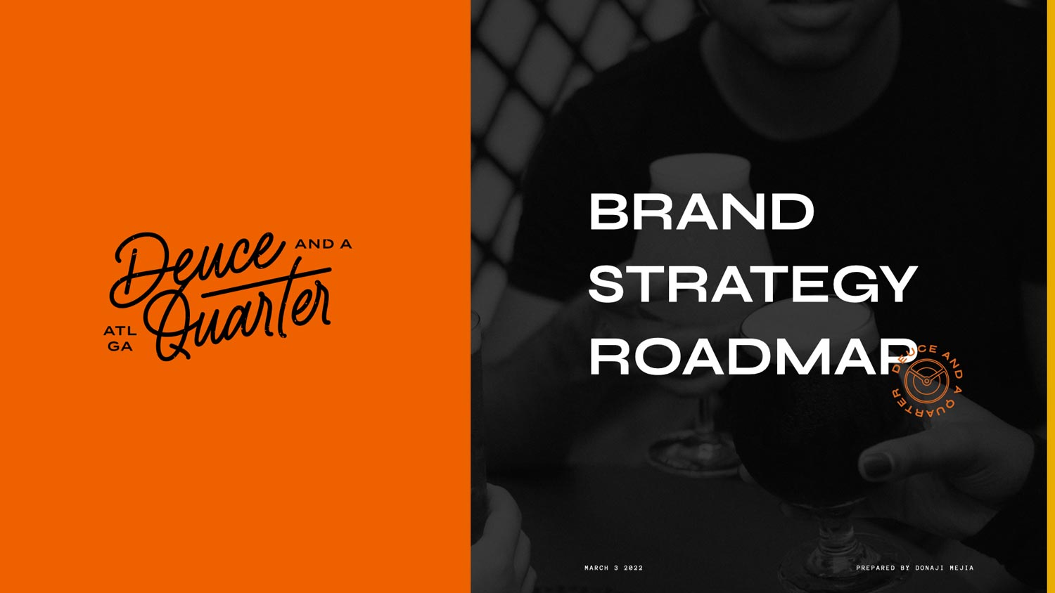
DEUCE AND A QUARTER


"Just like my grandfather's barbershop, I want Deuce and a Quarter to be a community anchor, so when you say "Deuce and a Quarter", people know what that means. I want people to have something that’s different—where they don’t feel like we have to fit in anywhere else."
*
DARREN ARMSTRONG
FOUNDER, DEUCE AND A QUARTER


“
CLIENT
Testimonial

ATLANTA
Georgia
DARREN ARMSTRONG
FOUNDER & CEO, DEUCE AND A QUARTER
The way in which we told the story—it's all tied together and connected the way that it should be.
DARREN ARMSTRONG
Founder & CEO
View Website ➔
Donají helped me create a focus. Everything kept coming back to the mission: branding, color, image, smallest details. She kept getting me back to my "why". I really value that. She also challenged me, she asked the right questions—questions I didn't ask myself.
Her acuity to detail—being able to translate the purpose and meaning to the visuals. The way in which we told the story—it's all tied together and connected the way that it should be. I'm most proud of the intentionality behind being really clear with the message. And in that clarity people are like "you're really passionate about that!". Donaji helping me contextualize that, you can't put a price on that.
+ CASE
STUDIES +


•
LET'S WORK
TOGETHER
READY TO PUSH BOUNDARIES,
MOVE HEARTS, & SHAKE THE WORLD?
Get Started with
The Brand Magic
Workshop

◆
UNAPOLOGETIC BRANDS FOR UNAPOLOGETIC HUMANS
FOR FOUNDERS ROOTED IN UNSHAKABLE VALUES
◆
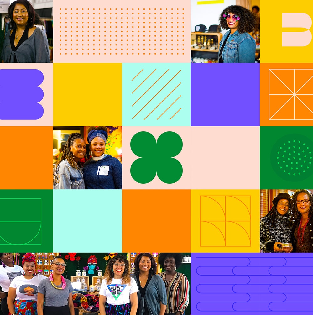
Brand strategy, branding design, and website design for women of color entrepreneurs, founders, leaders and BIPOC-led organizations in the Bay Area and beyond.
Latina-Owned / Veteran-Owned
© Donaji Mejia 2025
