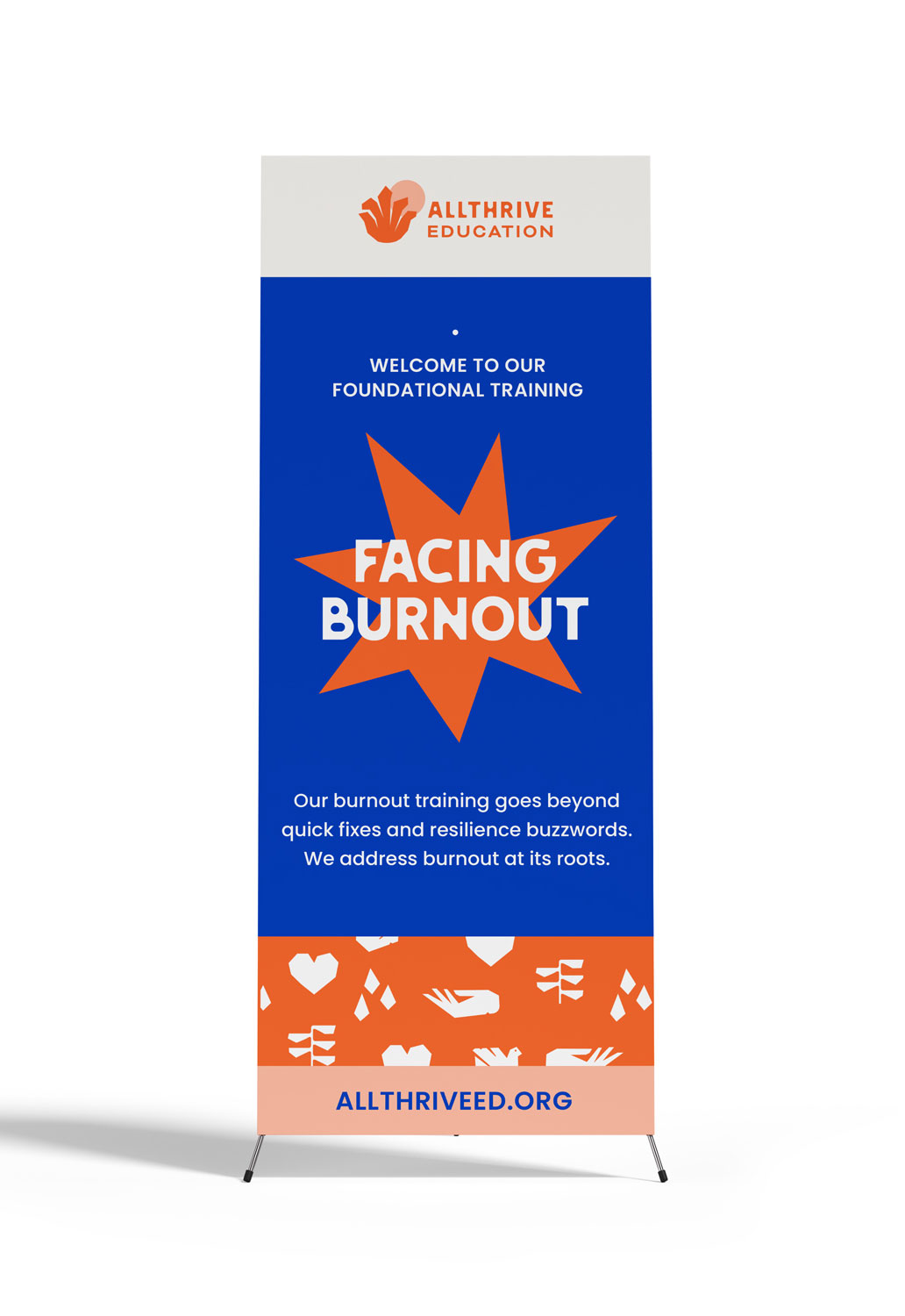
An educational organization dedicated to transforming the way community-based organizations address burnout and stress by getting to the root of the systemic problem.
SERVICES /
Brand Strategy
Branding Design
Web Design
Collateral
ABOUT /
Latina-Owned
Oakland, CA
Mexico City, MX
OVERVIEW /
AllThrive Education is an educational organization dedicated to transforming the way social justice and community-based organizations address burnout, stress, and collective care. Through culturally responsive practices and movement-aligned learning experiences, AllThrive builds strategies for healing and resilience that support long-term impact.
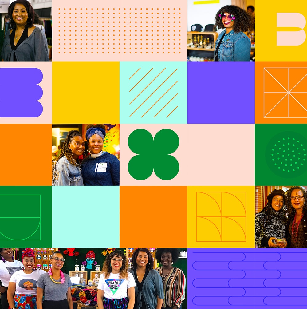
Since 2016, Just BE has been a vital support hub for Black women entrepreneurs in the Bay Area. In 2023, founder Hope unveiled a bold new vision—one that called for a complete brand overhaul to better reflect the community’s future and evolving mission.

CHALLENGE /
After transitioning from a co-founded structure to a single-member organization, Wendy faced the challenge of rebuilding trust and positioning AllThrive as an evolved, values-aligned business—without losing momentum or confusing long-standing clients. In addition, she was shifting audiences, expanding AllThrive's offerings to engage both community organizations and philanthropic partners. AllThrive needed a brand that could bridge those worlds, instill confidence, and reflect its growth into a more strategic, visionary phase.
After transitioning from a co-founded structure to a single-member organization, Wendy faced the challenge of rebuilding trust and positioning AllThrive as an evolved, values-aligned business—without losing momentum or confusing long-standing clients. In addition, she was shifting audiences, expanding AllThrive's offerings to engage both community organizations and philanthropic partners. AllThrive needed a brand that could bridge those worlds, instill confidence, and reflect its growth into a more strategic, visionary phase.
After transitioning from a co-founded structure to a single-member organization, Wendy faced the challenge of rebuilding trust and positioning AllThrive as an evolved, values-aligned business—without losing momentum or confusing long-standing clients. In addition, she was shifting audiences, expanding AllThrive's offerings to engage both community organizations and philanthropic partners. AllThrive needed a brand that could bridge those worlds, instill confidence, and reflect its growth into a more strategic, visionary phase.
After transitioning from a co-founded structure to a single-member organization, Wendy faced the challenge of rebuilding trust and positioning AllThrive as an evolved, values-aligned business—without losing momentum or confusing long-standing clients. In addition, she was shifting audiences, expanding AllThrive's offerings to engage both community organizations and philanthropic partners. AllThrive needed a brand that could bridge those worlds, instill confidence, and reflect its growth into a more strategic, visionary phase.
APPROACH /
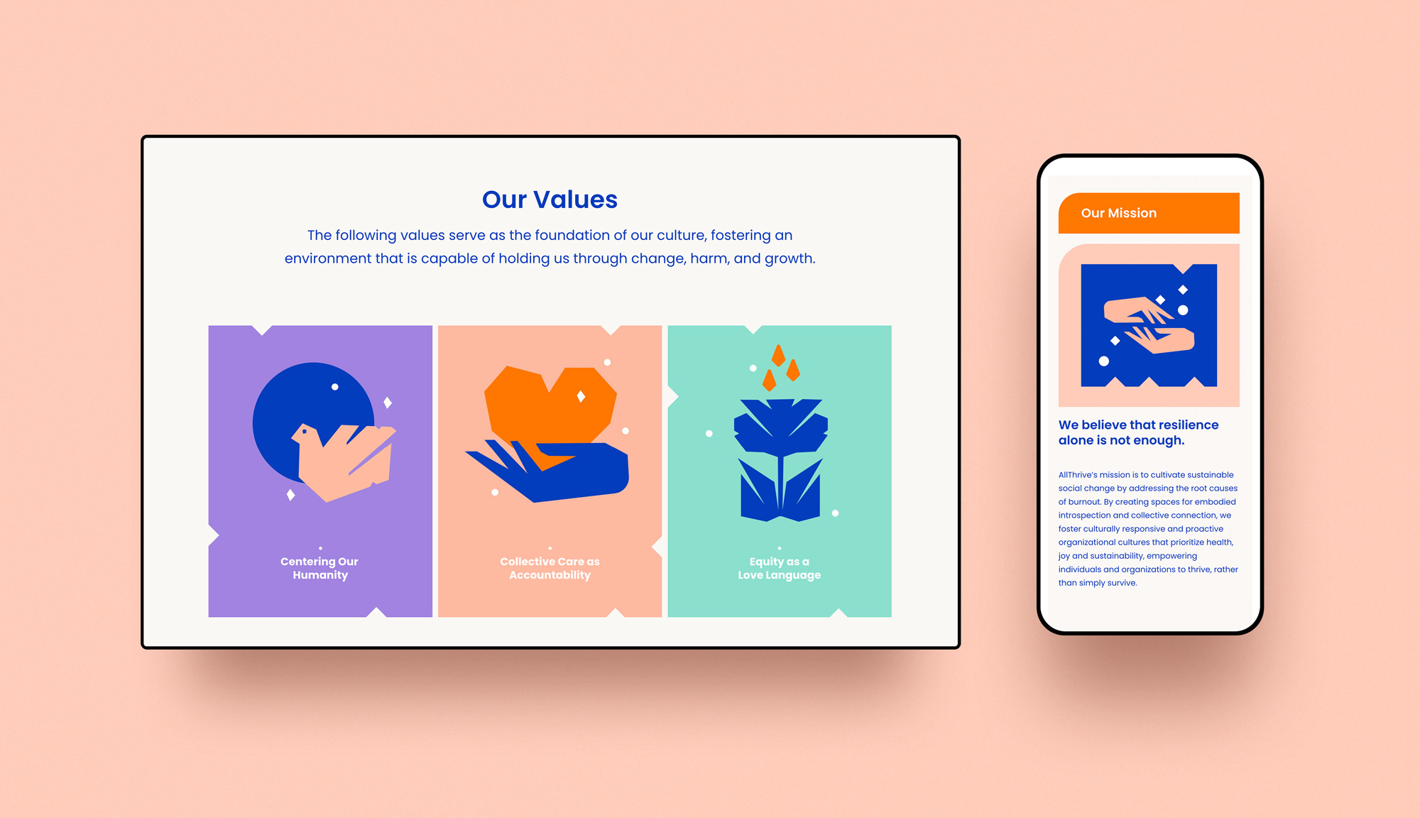
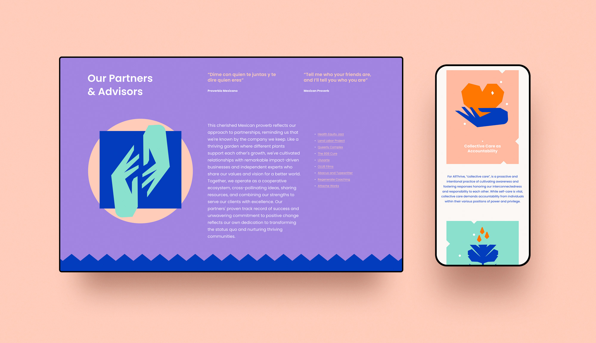
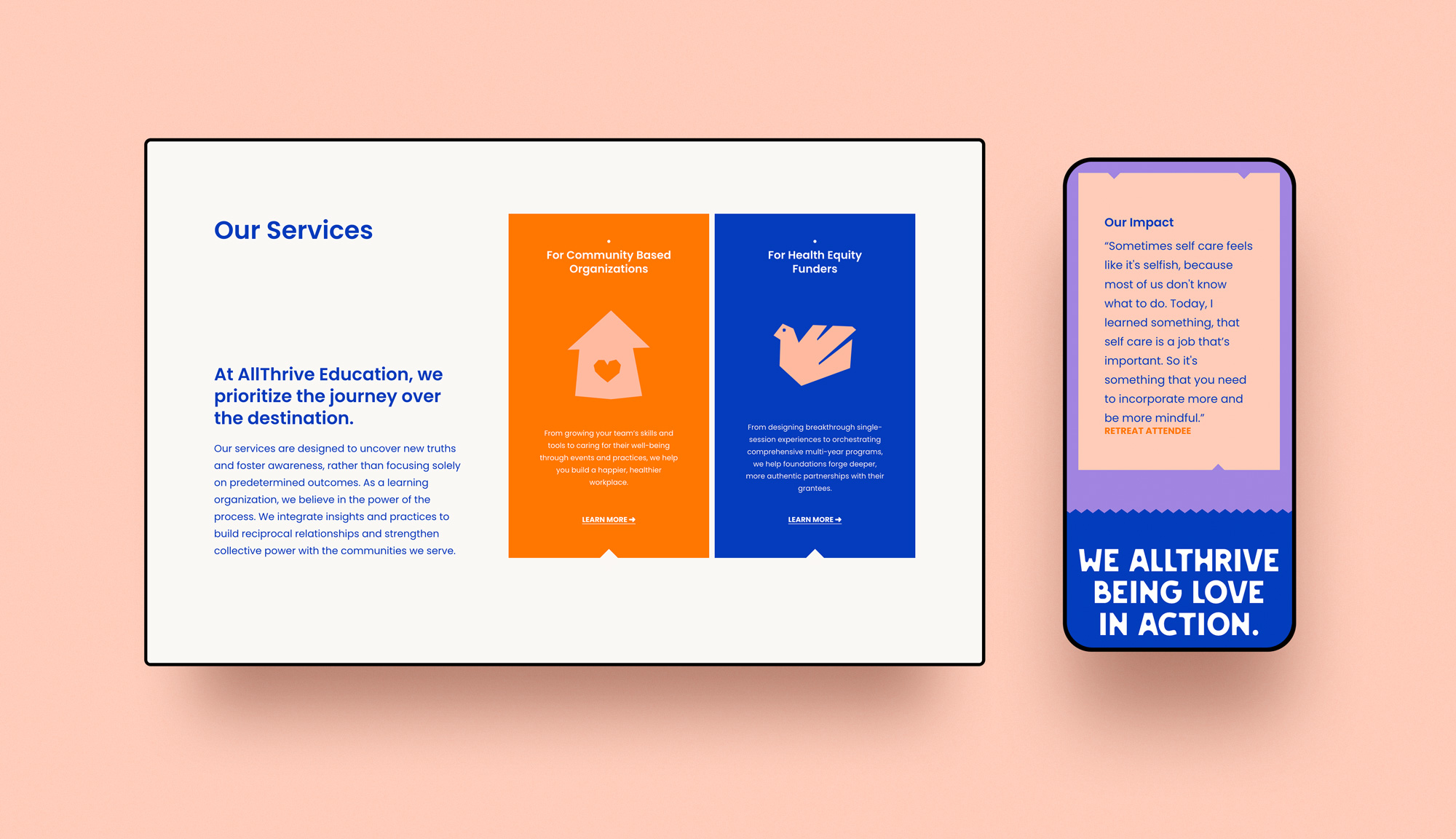
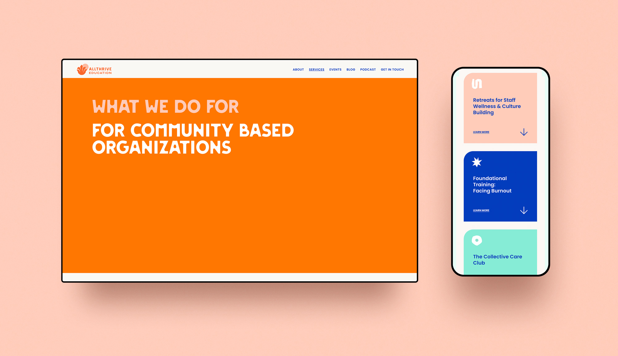
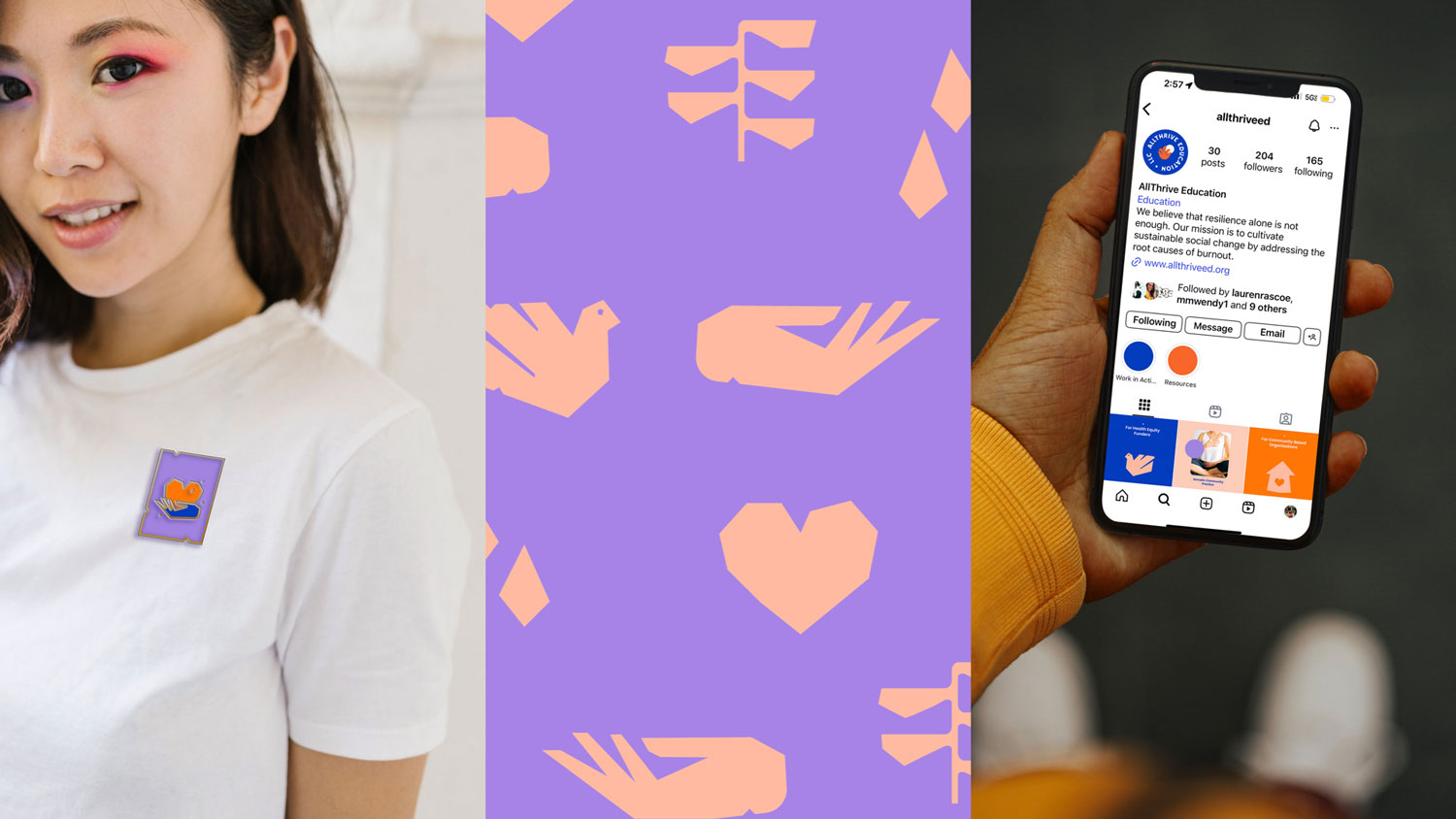
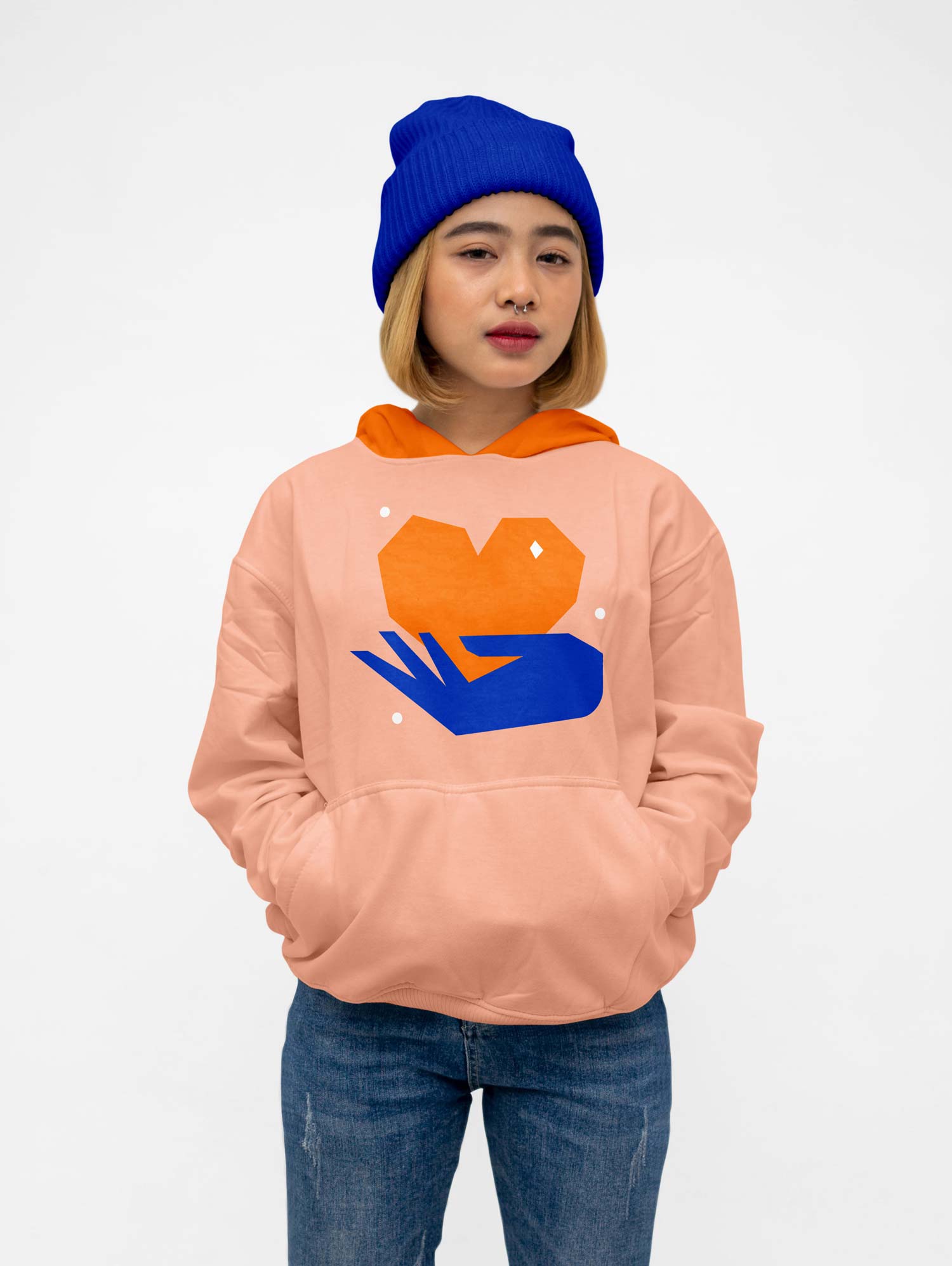
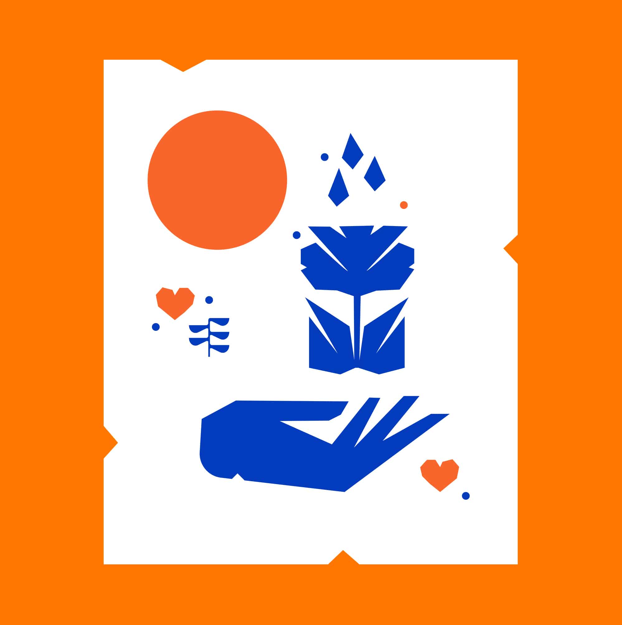
We drew deeply from Wendy’s Mexican heritage to create a vibrant brand inspired by papel picado—a beloved form of Mexican folk art. The goal was to design something that felt unmistakably rooted in her culture, while also celebrating creativity, joy, and authenticity. The brand needed to feel expressive and bold, but still warm, loving, and welcoming to all.
We built a custom library of stylized icons, selected bold graphic typefaces with a bit of character for headlines, and developed a color palette that balanced saturated tones with softer hues—creating a high-contrast look that feels confident without losing its heart.
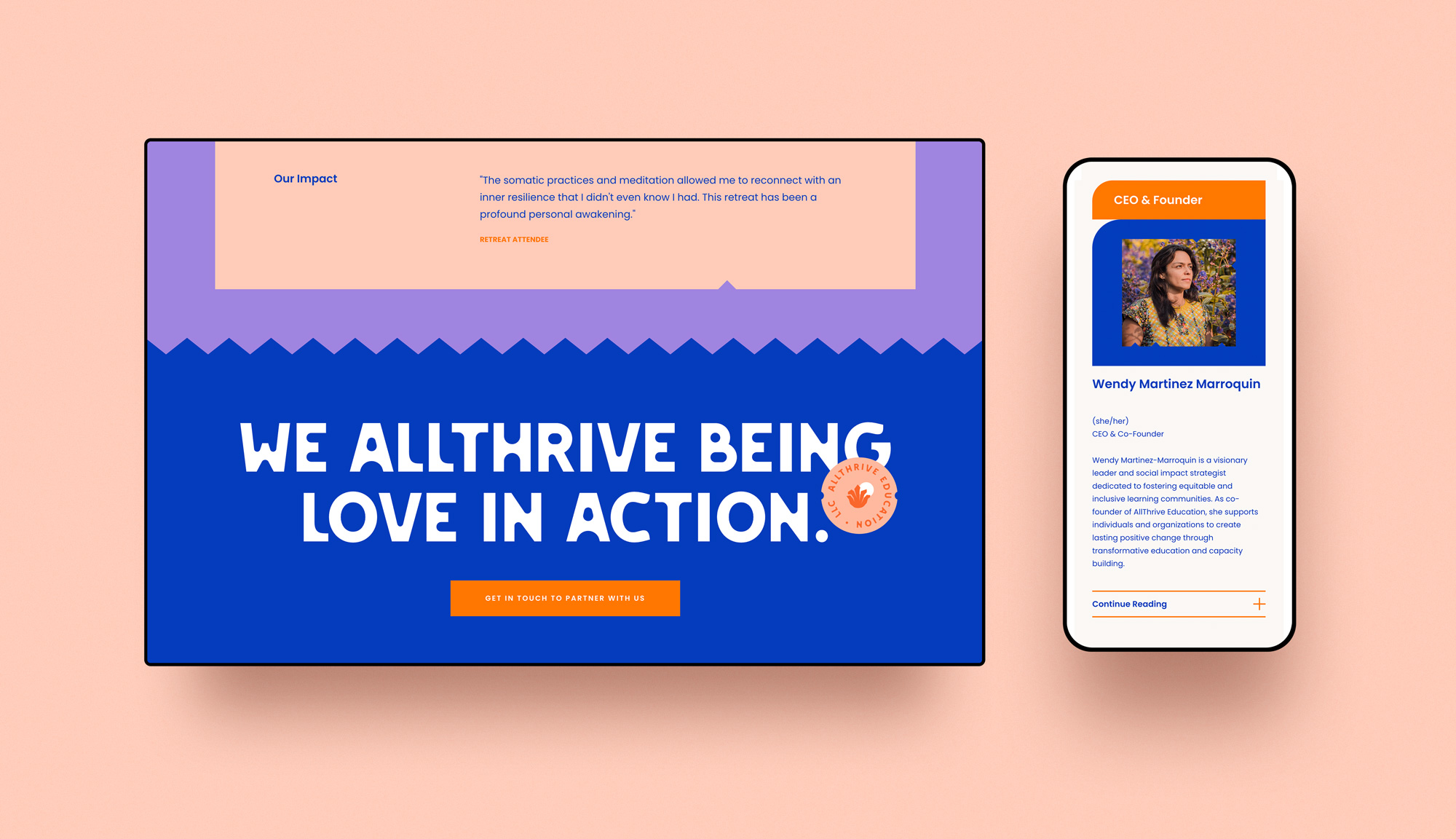
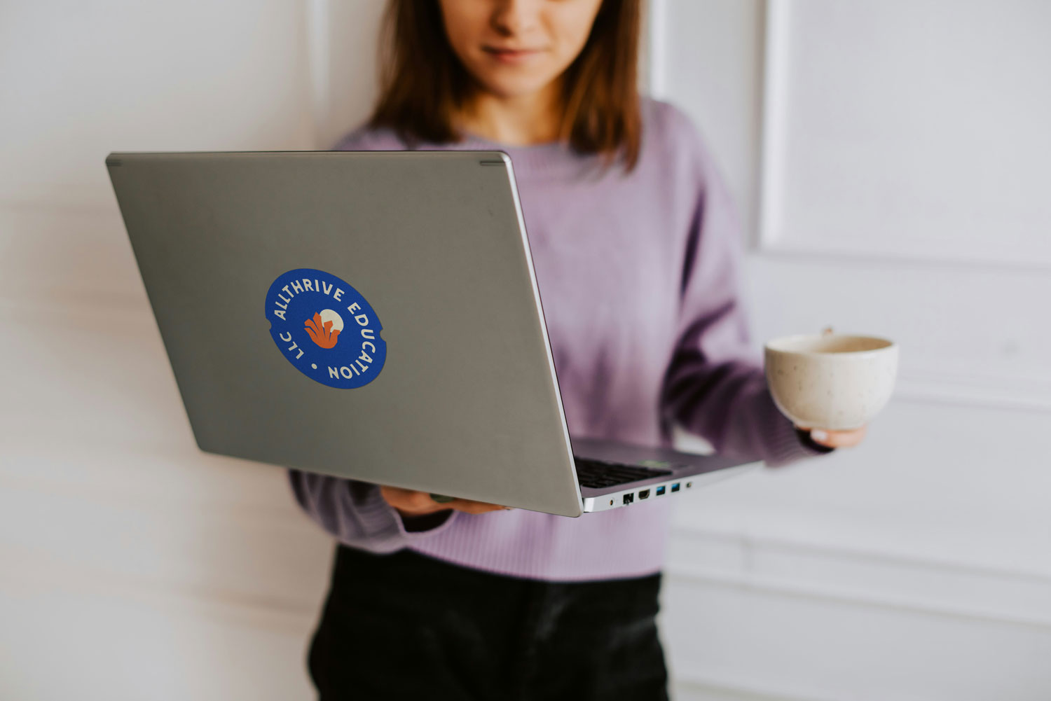
The final logo features a simplified, abstract agave plant symbolizing transformation, thriving, and resilience. A radiant sun rises behind it, representing mindfulness, warmth, and the power of community connection.
We drew deeply from Wendy’s Mexican heritage to create a vibrant brand inspired by papel picado—a beloved form of Mexican folk art. The goal was to design something that felt unmistakably rooted in her culture, while also celebrating creativity, joy, and authenticity. The brand needed to feel expressive and bold, but still warm, loving, and welcoming to all.
We built a custom library of stylized icons, selected bold graphic typefaces with a bit of character for headlines, and developed a color palette that balanced saturated tones with softer hues—creating a high-contrast look that feels confident without losing its heart.
The final logo features a simplified, abstract agave plant symbolizing transformation, thriving, and resilience. A radiant sun rises behind it, representing mindfulness, warmth, and the power of community connection.
IMPACT /
Through the rebrand process we gave AllThrive more than a new visual identity—we provided clarity, confidence, and a grounded sense of direction. With a renewed voice and values, founder Wendy felt equipped to speak about the work with purpose and power, stepping into her role as a thought leader. The rebrand became a source of resilience during times of economic uncertainty, offering a deeper belief in the business and its mission. Today, AllThrive shows up not only with beauty and professionalism—but with intention, integrity, and the tools to keep growing.
Through the rebrand process we gave AllThrive more than a new visual identity—we provided clarity, confidence, and a grounded sense of direction. With a renewed voice and values, founder Wendy felt equipped to speak about the work with purpose and power, stepping into her role as a thought leader. The rebrand became a source of resilience during times of economic uncertainty, offering a deeper belief in the business and its mission. Today, AllThrive shows up not only with beauty and professionalism—but with intention, integrity, and the tools to keep growing.
Through the rebrand process we gave AllThrive more than a new visual identity—we provided clarity, confidence, and a grounded sense of direction. With a renewed voice and values, founder Wendy felt equipped to speak about the work with purpose and power, stepping into her role as a thought leader. The rebrand became a source of resilience during times of economic uncertainty, offering a deeper belief in the business and its mission. Today, AllThrive shows up not only with beauty and professionalism—but with intention, integrity, and the tools to keep growing.

◆
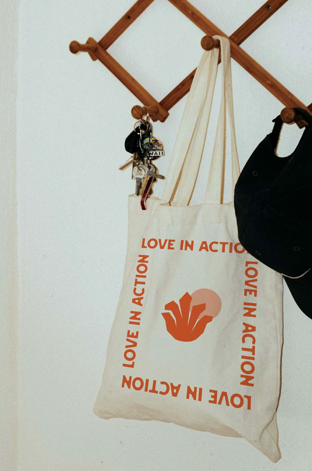
We AllThrive being love in action.
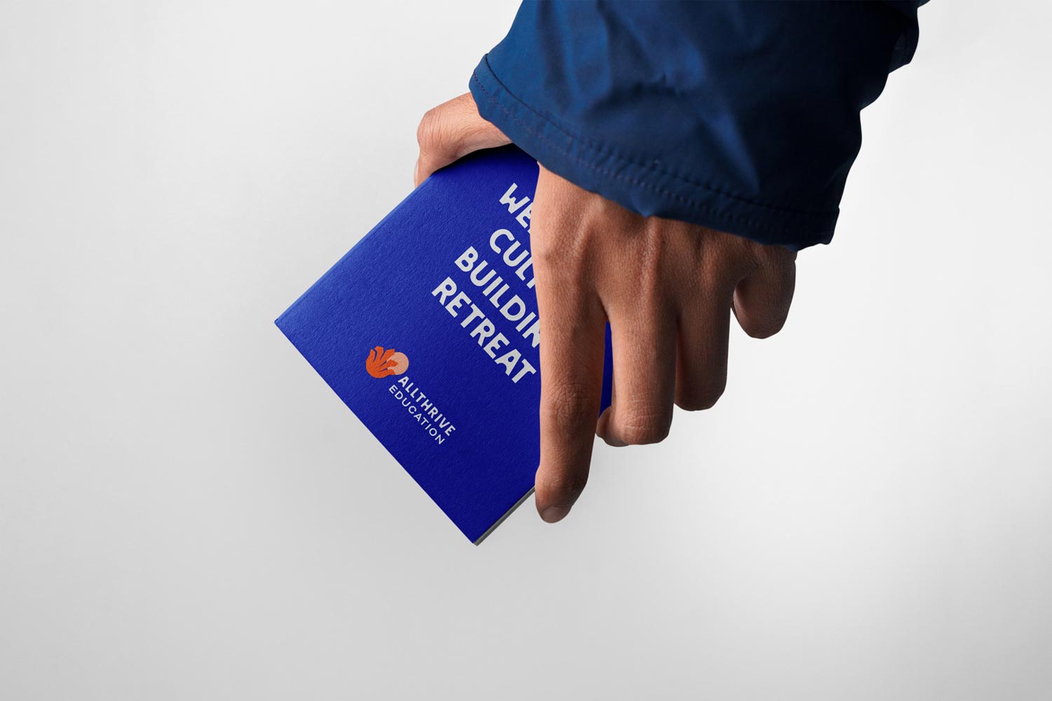
ALLTHRIVE EDUCATION
◆
We AllThrive being love in action.
ALLTHRIVE EDUCATION
ORIGINAL LOGO
ORIGINAL LOGO
NEW LOGO
The final result is a custom logo that takes a stance. While the bold font looks strong it is also friendly and inviting. With a much curvier and feminine look, it speaks to the brand's audience, playfulness, and unapologetic values.
The final result is a custom logo that takes a stance. While the bold font looks strong it is also friendly and inviting. With a much curvier and feminine look, it speaks to the brand's audience, playfulness, and unapologetic values.
The final result is a custom logo that takes a stance. While the bold font looks strong it is also friendly and inviting. With a much curvier and feminine look, it speaks to the brand's audience, playfulness, and unapologetic values.
The final result is a custom logo that takes a stance. While the bold font looks strong it is also friendly and inviting. With a much curvier and feminine look, it speaks to the brand's audience, playfulness, and unapologetic values.


“
CLIENT
Testimonial

OAKLAND
California
WENDY MARTINEZ MARROQUIN
CO-FOUNDER & CEO, ALLTHRIVE EDUCATION
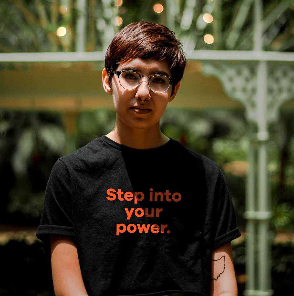
When you feel confident and proud of your brand, you just show up so much different in the work that you do.
WENDY MARTINEZ MARROQUIN
Co-Founder & CEO
View Case Study ➔
The branding process was so magical—I could see what we could be. Donají gave us a personality and so much more that I hadn’t seen for myself. She saw us in a more grand and more powerful way. This process was a transformative experience, like, “let me grow up and embody that”.
So for anyone thinking, "should I do this?" Go for it. Every penny of it is worth it. It really was one of the best investment I've made in my business since we started.
Donají runs a tight machine and has all the tools in place—she knows exactly what she's doing. And the final product—it’s gorgeous. I'm so in love with the website. It completely exceeded my expectations.
Finally, Donají understands entrepreneur women of color in small businesses and has an ability to see and help people see themselves in a more powerful way. She talks about “standing proudly in your power”, and that’s what I'm finding after this process—I’m standing proudly in my own power.
+ CASE
STUDIES +


•
LET'S WORK
TOGETHER
READY TO PUSH BOUNDARIES,
MOVE HEARTS, & SHAKE THE WORLD?
Get Started with
The Brand Magic
Workshop

◆
UNAPOLOGETIC BRANDS FOR UNAPOLOGETIC HUMANS
FOR FOUNDERS ROOTED IN UNSHAKABLE VALUES
◆
Brand strategy, branding design, and website design for women of color entrepreneurs, founders, leaders and BIPOC-led organizations in the Bay Area and beyond.
Latina-Owned / Veteran-Owned
© Donaji Mejia 2025
