A nonprofit empowering women through inclusive experiences and a community of sisterhood.
SERVICES /
Brand Strategy
Branding Design
Web Design
Collateral
ABOUT /
Woman of Color Founded & Led
Oakland, CA


OVERVIEW /
Sol Sisters is an Oakland-based nonprofit creating safe, inclusive spaces for diverse women seeking personal and professional growth and community. With a loyal audience and evolving programs, they were ready to level up how their brand communicated their impact and vision.

CHALLENGE /
Sol Sisters was in a period of transition. They needed clarity on who they were, what they offered, and how to communicate it all with confidence and cohesion. Their goals included refining their mission and services, building a brand identity that felt aligned and professional, and preparing for a full-scale relaunch with a more refined offerings and events.
Sol Sisters was in a period of transition. They needed clarity on who they were, what they offered, and how to communicate it all with confidence and cohesion. Their goals included refining their mission and services, building a brand identity that felt aligned and professional, and preparing for a full-scale relaunch with a more refined offerings and events.
Sol Sisters was in a period of transition. They needed clarity on who they were, what they offered, and how to communicate it all with confidence and cohesion. Their goals included refining their mission and services, building a brand identity that felt aligned and professional, and preparing for a full-scale relaunch with a more refined offerings and events.
APPROACH /
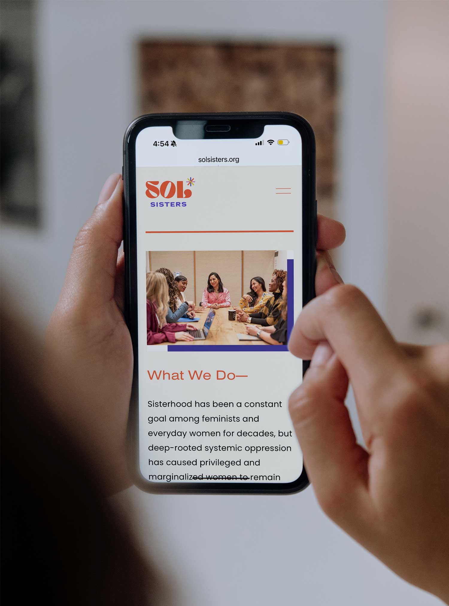
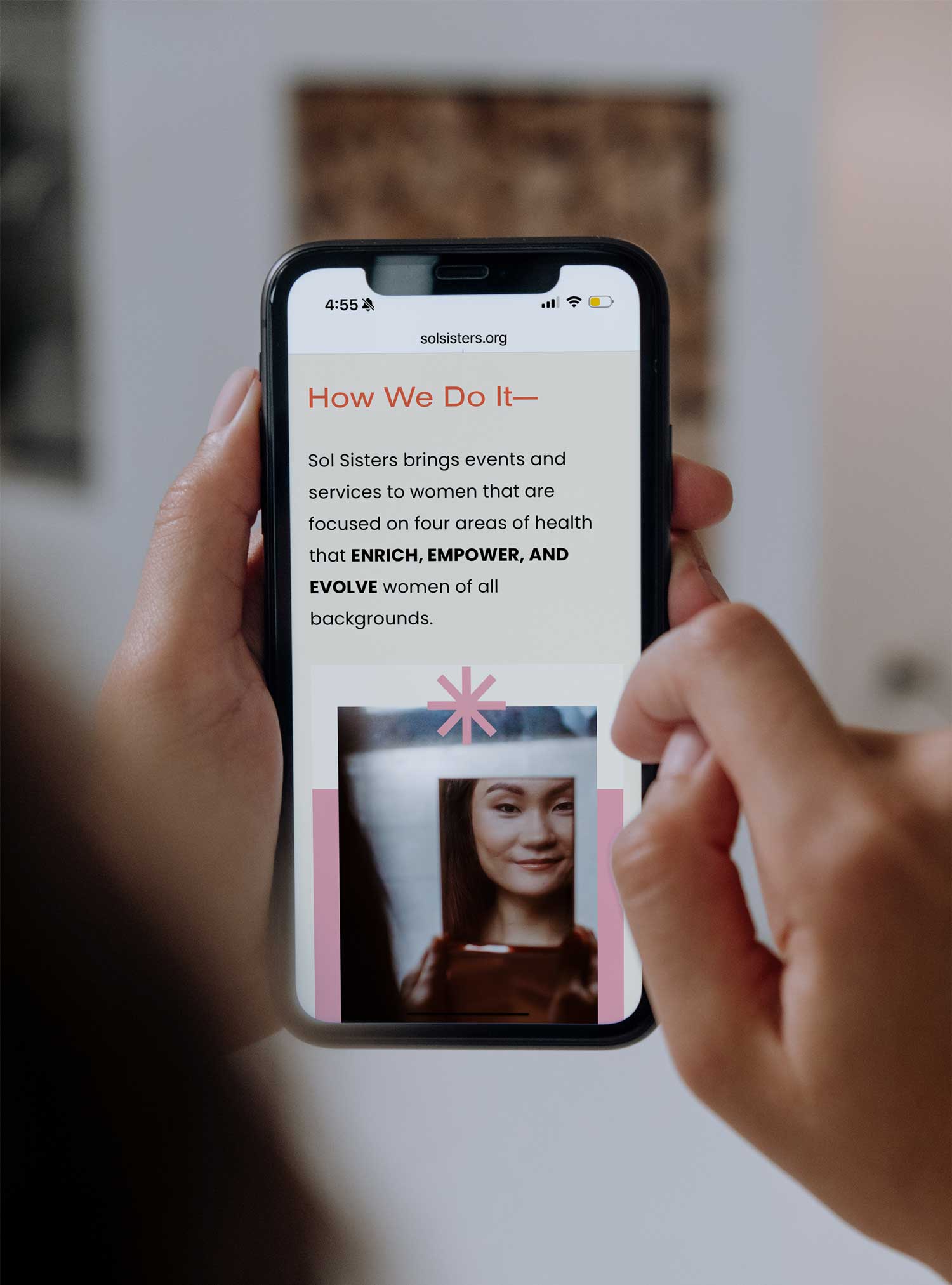
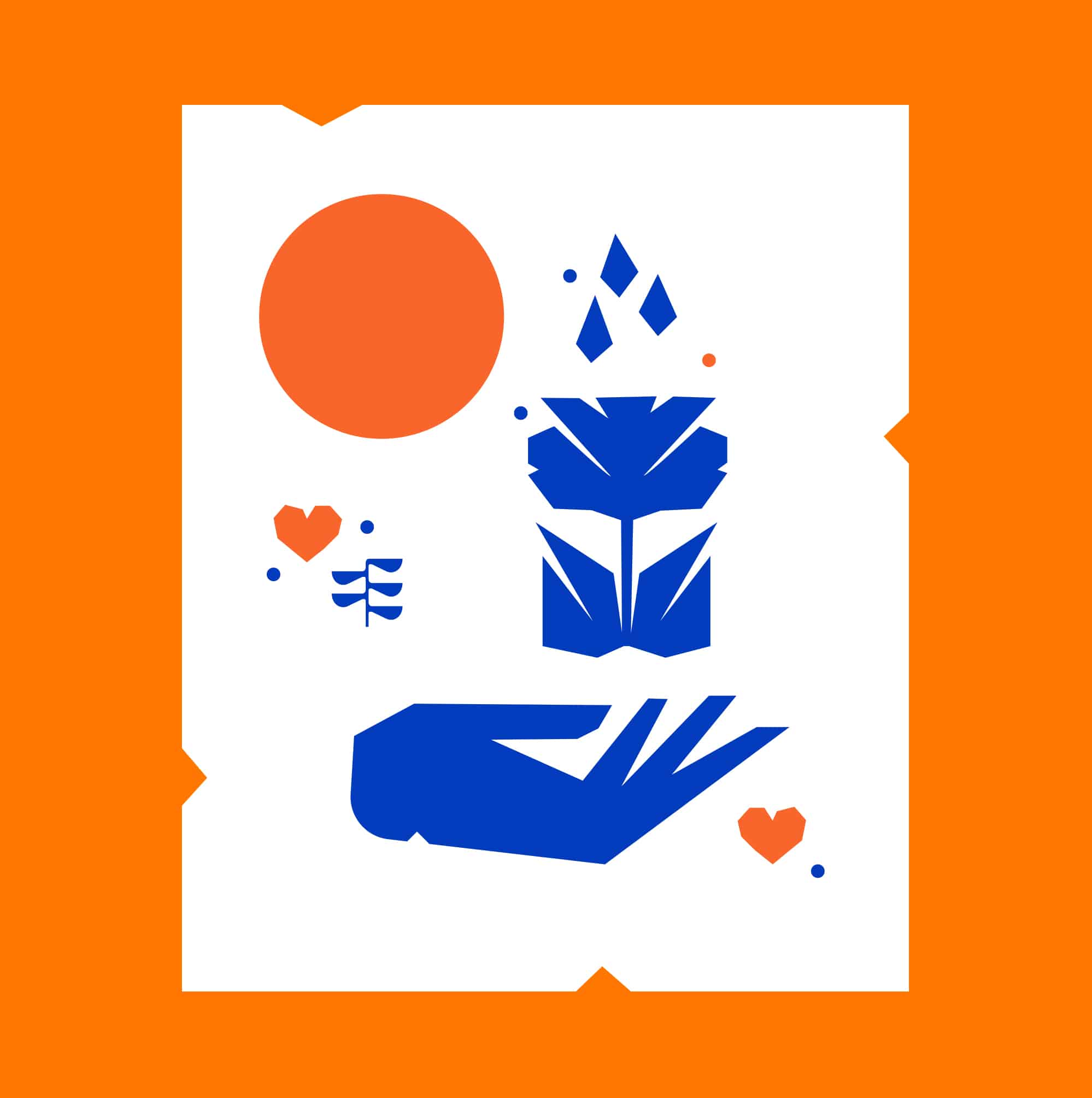
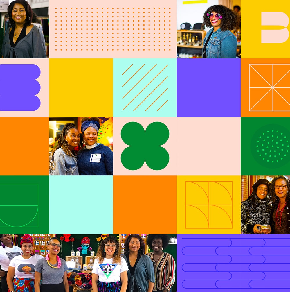
Together with the Sol Sisters' board, we began by grounding the organization in a clear mission, updated programming, and a refined voice. The new brand needed to feel energetic, feminine, and fun—reflecting the vibrancy of their community while communicating their core offerings across mental health, physical health, expressive arts, and professional development.
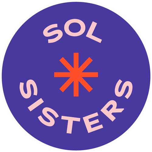
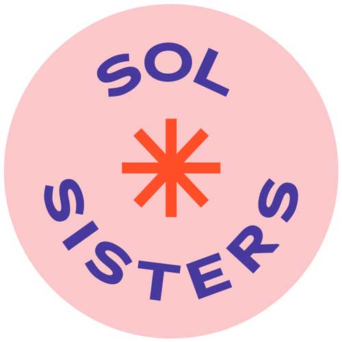
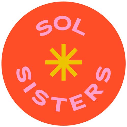
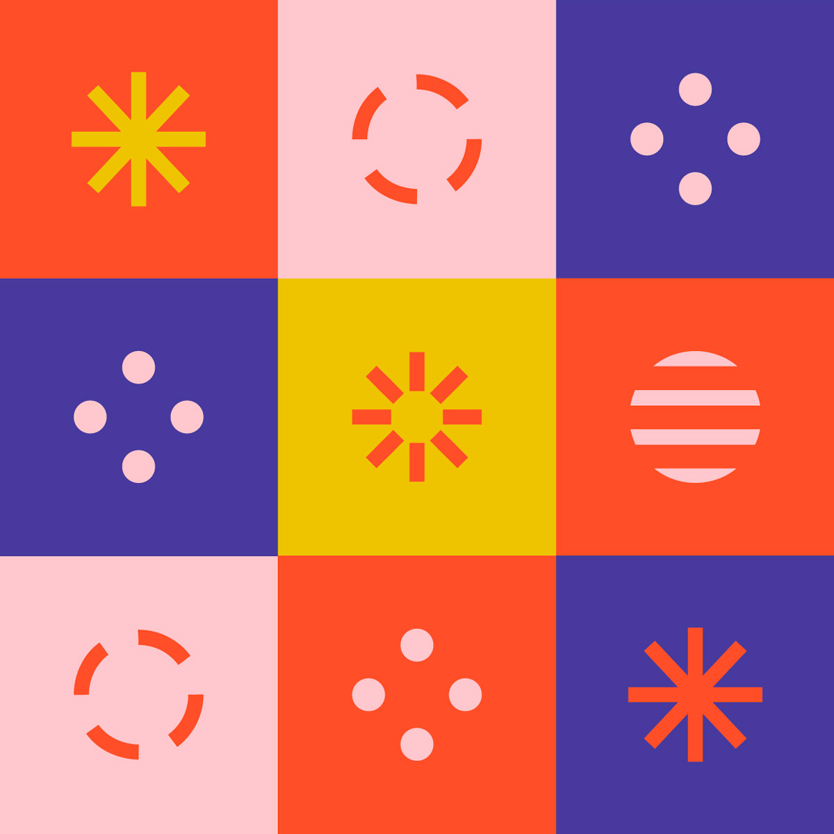
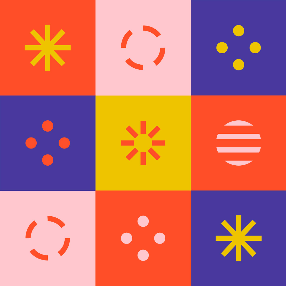
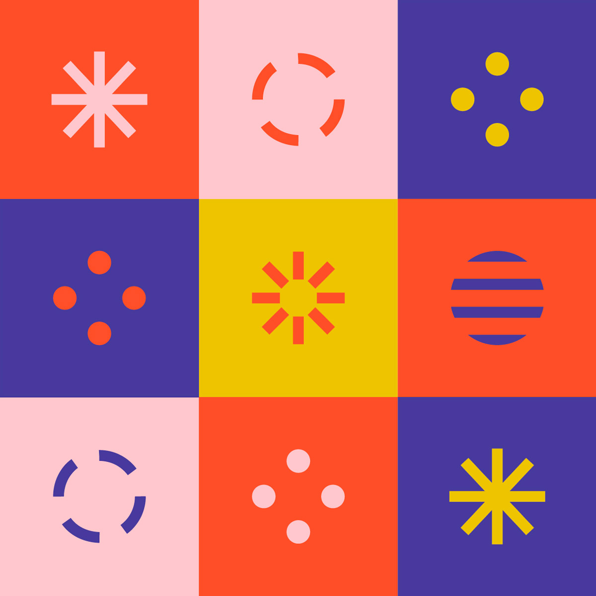
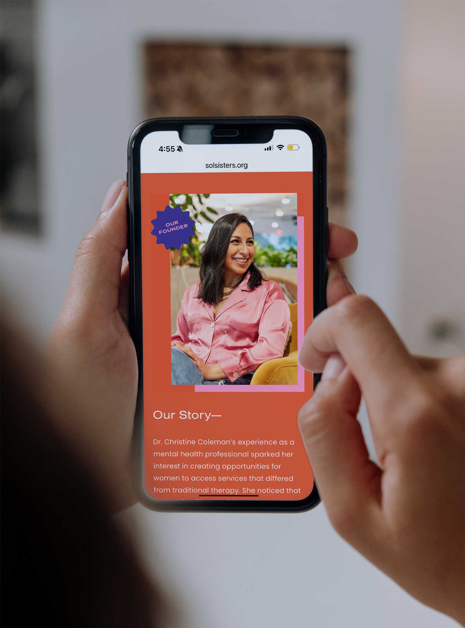
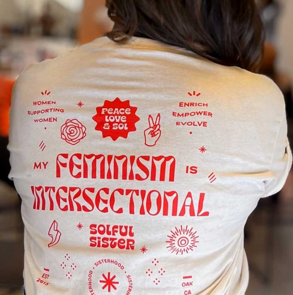
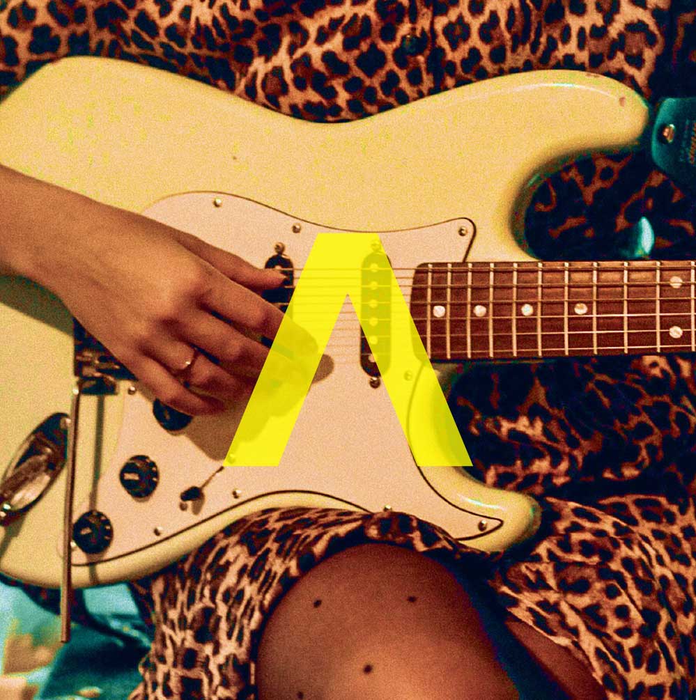
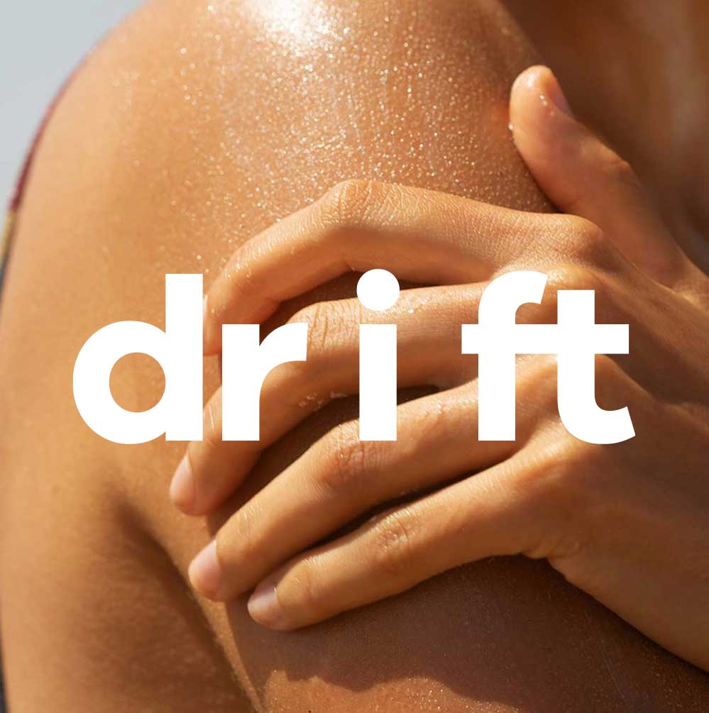
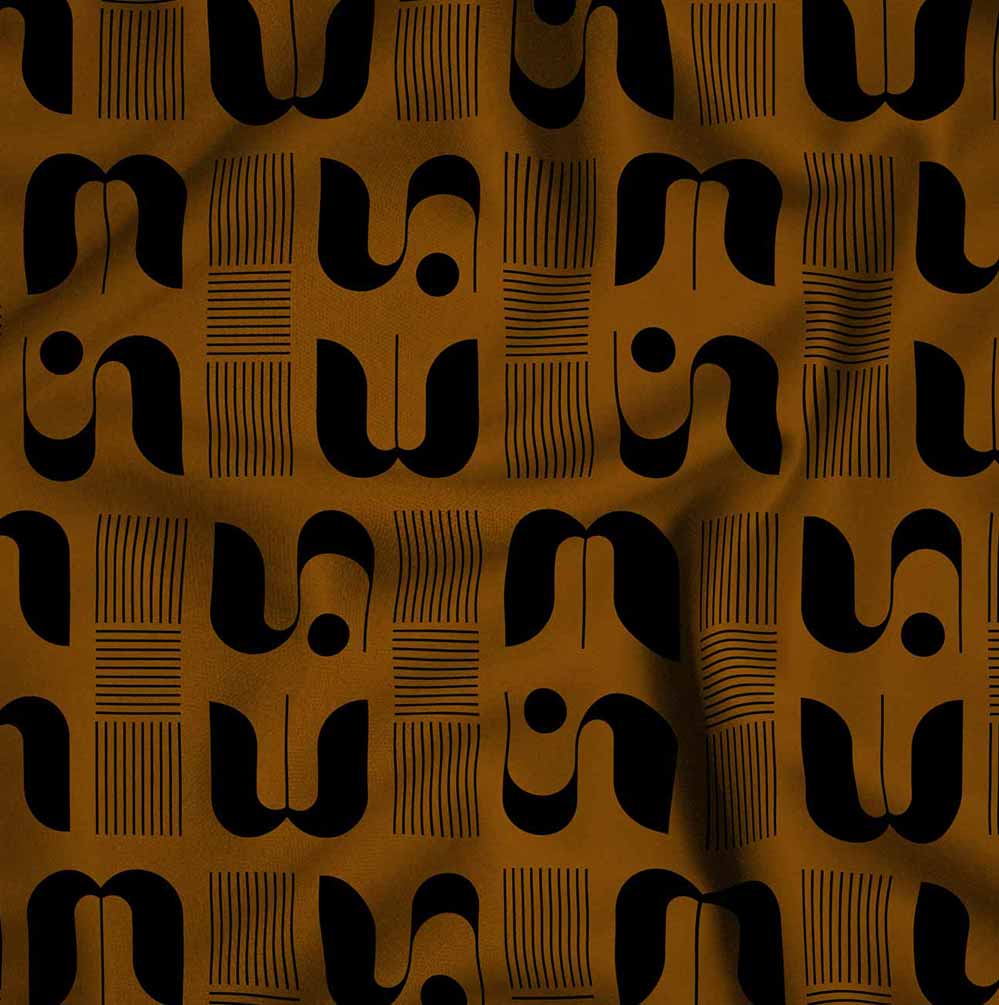
With their brand archetype in mind, we created a bold, playful, and inviting identity that brings their work to life. A custom color palette connects to their core service areas, while a bold-meets-soft logo system blends playfulness with professionalism. The sunburst icon represents radiance, diversity, and the power of community, tying back to both the name and the mission.
With a flexible visual system, custom icons, and an uplifting tone, the new brand positions Sol Sisters for deeper engagement, stronger partnerships, and a future full of growth.
Together with the Sol Sisters' board, we began by grounding the organization in a clear mission, updated programming, and a refined voice. The new brand needed to feel energetic, feminine, and fun—reflecting the vibrancy of their community while communicating their core offerings across mental health, physical health, expressive arts, and professional development.
With their brand archetype in mind, we created a bold, playful, and inviting identity that brings their work to life. A custom color palette connects to their core service areas, while a bold-meets-soft logo system blends playfulness with professionalism. The sunburst icon represents radiance, diversity, and the power of community, tying back to both the name and the mission.
With a flexible visual system, custom icons, and an uplifting tone, the new brand positions Sol Sisters for deeper engagement, stronger partnerships, and a future full of growth.
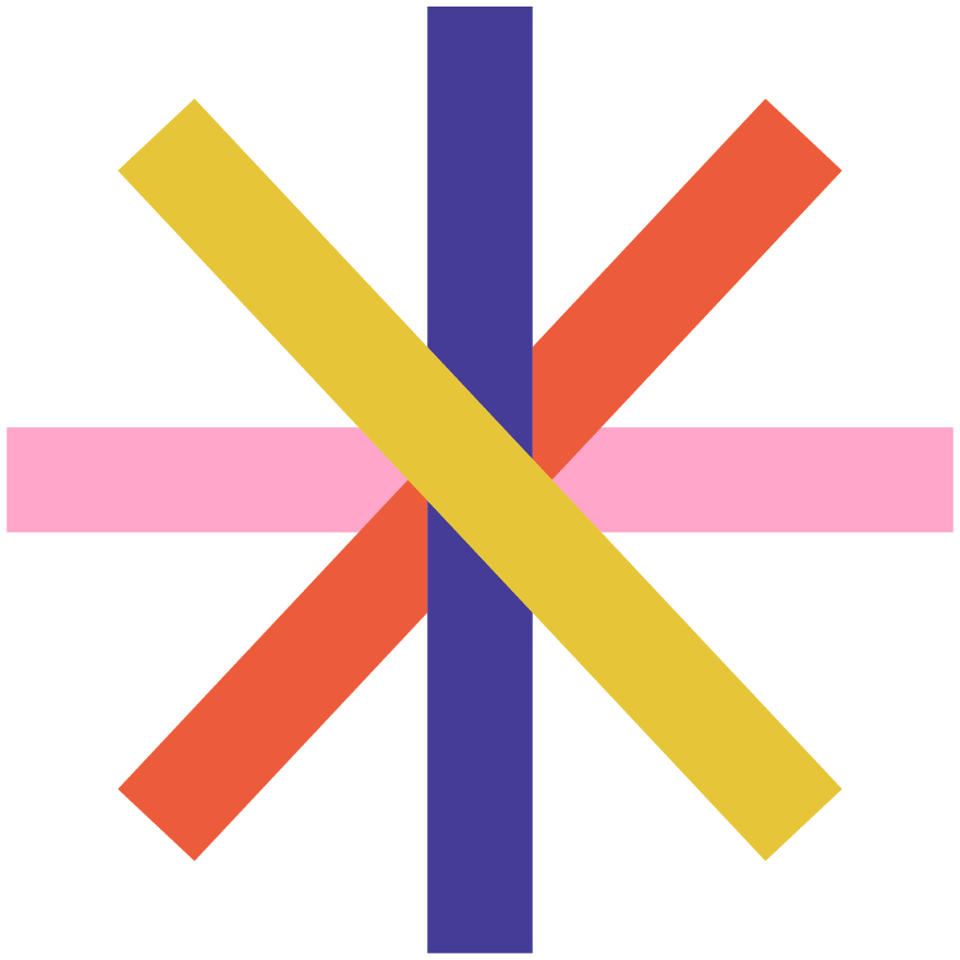


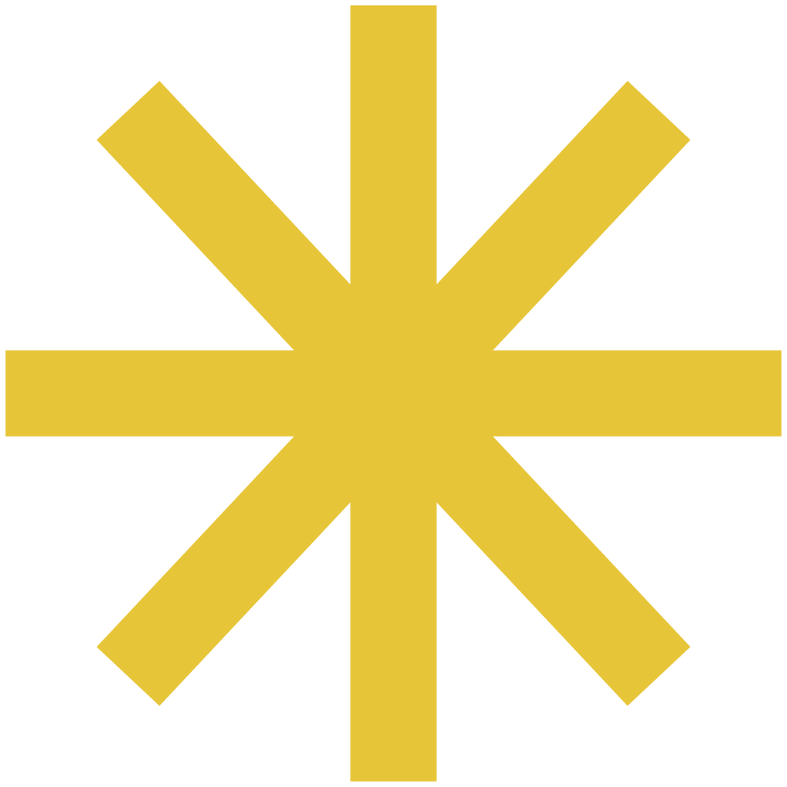

The sunburst icon represents radiance, diversity, and the power of community, tying back to both the name and the mission.

◆
Helping women overcome societal barriers through educational and empowering experiences.
SOL SISTERS
◆
Helping women overcome societal barriers through educational and empowering experiences.
SOL SISTERS
◆
Helping women overcome societal barriers through educational and empowering experiences.
SOL SISTERS


BEFORE

AFTER

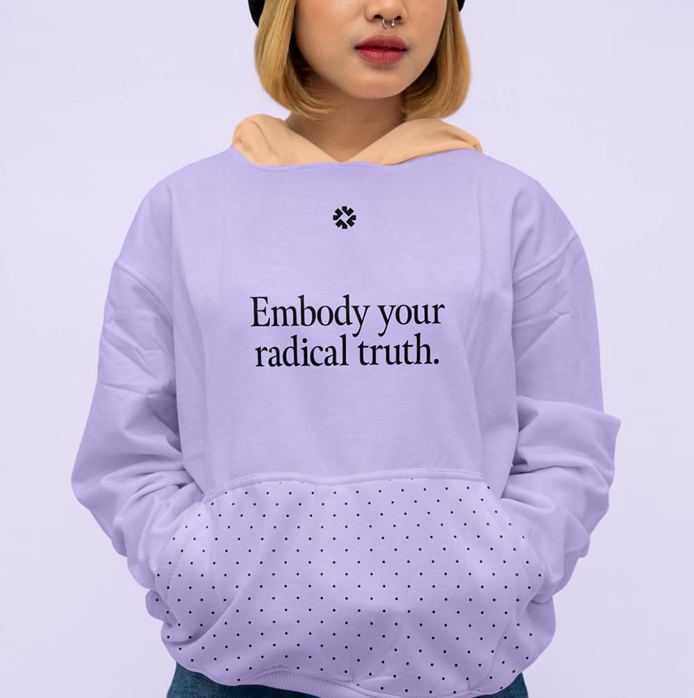
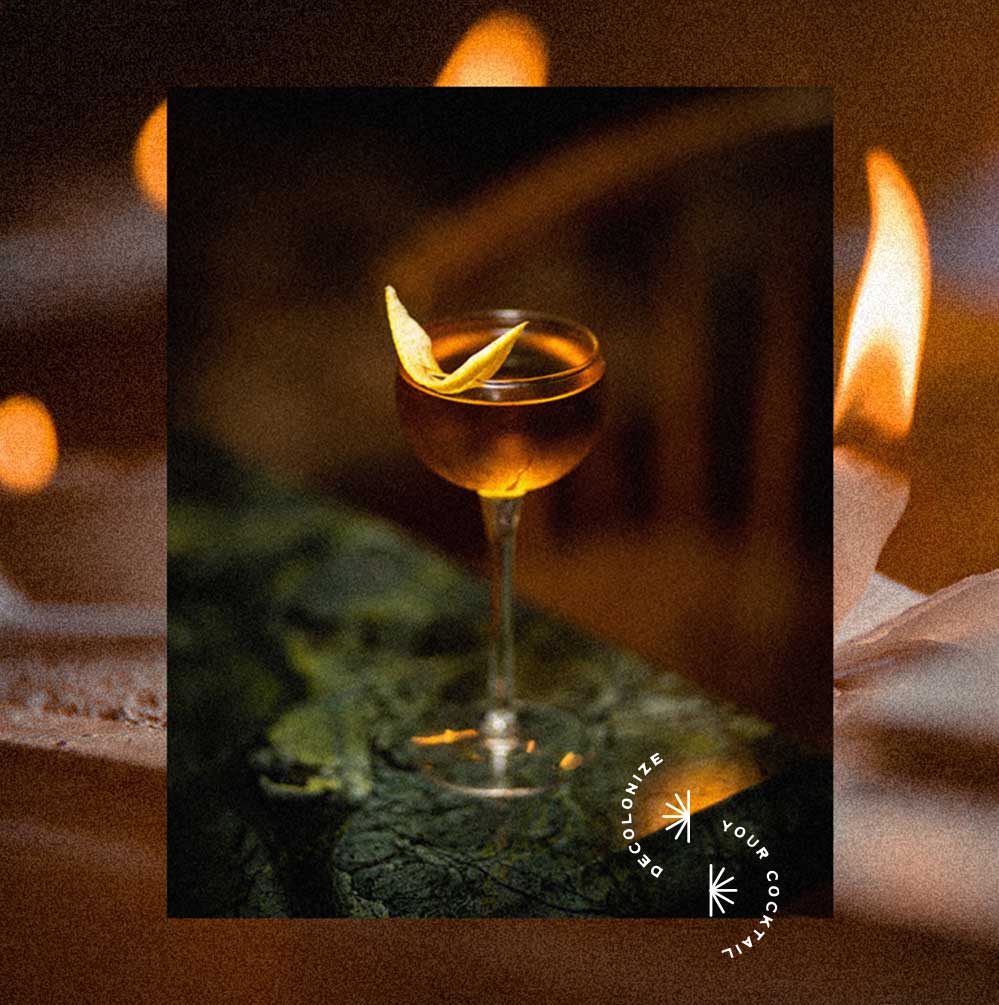
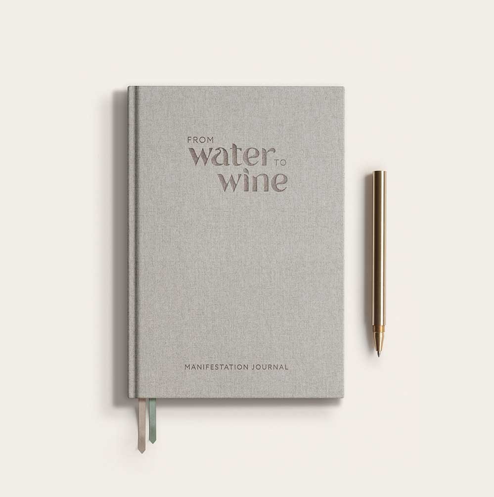
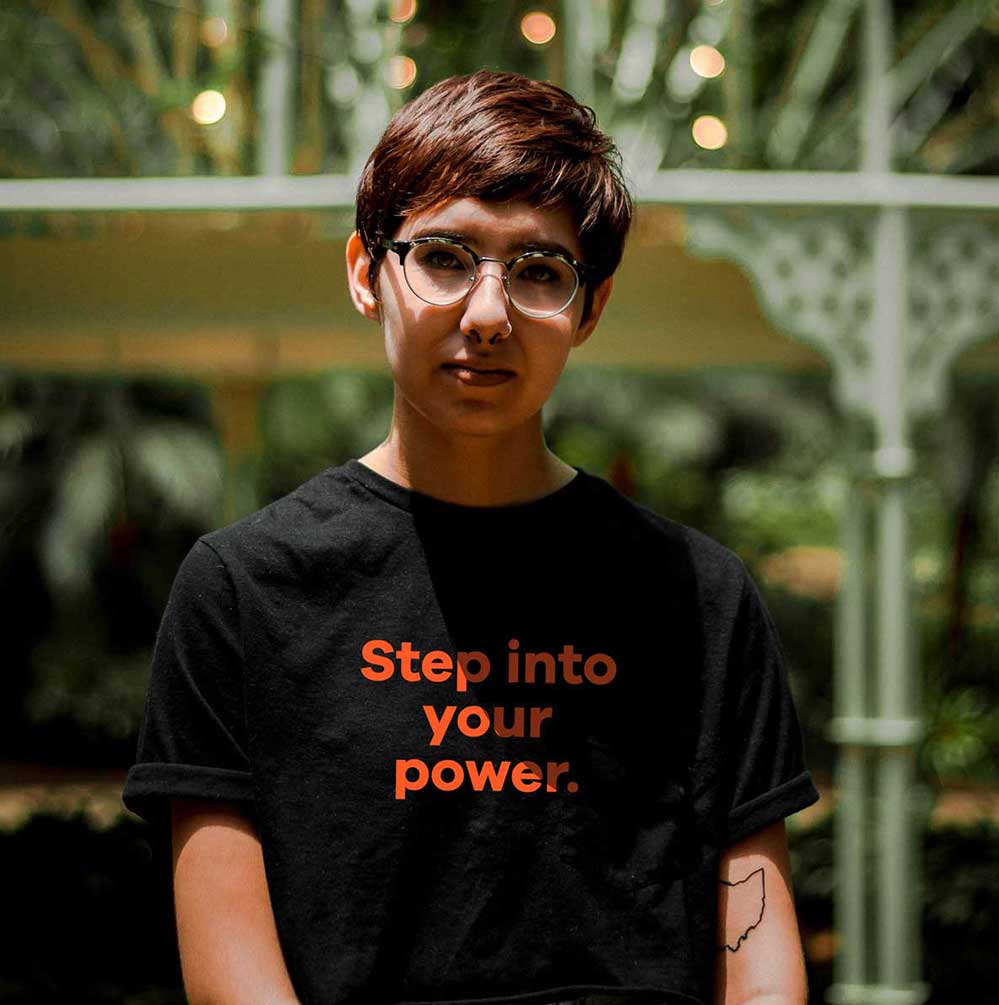
SPECIAL MERCH DESIGN


“
CLIENT
Testimonial

OAKLAND
California
DR. CHRISTINE COLEMAN
FOUNDER & EXECUTIVE DIRECTOR, SOL SISTERS
The brand now is an anchor in all we do, so the impact is substantial.
DR. CHRISTINE COLEMAN
Founder & Executive Director
Website ➔
We were looking for a visual refresh but together with the board, Donají pushed us to think outside of my own lens and understanding. With Sol 2.0, we wanted to step up in our community presence and for people taking our non-profit in a more desired way—in a way that would entice peple to join our network, donate, etc. We wanted a brand that was really solid and polished and communicated the significant work we've done.
As a business person I now understand branding in a whole new way. This process helped me understand how branding plays into marketing or fundraising—it's the epicenter of all the different things we already have going on. The impact is that now we can then work more efficiently. The brand now is an anchor in all we do, so the impact is substantial.
I didn't know all it took to build a solid brand. I was pleasently surprised how detailed Donají was. She invested a lot of time and energy into us and really pushed me in a really good way. One of the things I learned in this time being with her is that this is all part of the process of being a leader. It challenged me to think bigger, more critically, but I didn't feel like I was alone in that.
I really appreciated that she were able to grab what she was hearing and put it concisely into really beautiful terms and ideas. That's a huge skill. It was a hard process but it was all worth it. I feel very proud.
+ CASE
STUDIES +


•
LET'S WORK
TOGETHER
READY TO PUSH BOUNDARIES,
MOVE HEARTS, & SHAKE THE WORLD?
Get Started with
The Brand Magic
Workshop

◆
UNAPOLOGETIC BRANDS FOR UNAPOLOGETIC HUMANS
FOR FOUNDERS ROOTED IN UNSHAKABLE VALUES
◆
Brand strategy, branding design, and website design for women of color entrepreneurs, founders, leaders and BIPOC-led organizations in the Bay Area and beyond.
Latina-Owned / Veteran-Owned
© Donaji Mejia 2025
