An independent abortion provider & reproductive health clinic advocating for reproductive justice across the southeast.
SERVICES /
Brand Strategy
Naming
Branding Design
Web Design
Collateral
ABOUT /
Black Woman-Led
Atlanta, GA

OVERVIEW /
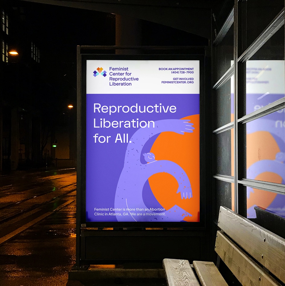
Feminist Center for Reproductive Liberation is a 50-year-old independent abortion provider and reproductive health clinic advocating for reproductive justice across the Southeast. Beyond healthcare, they are a movement committed to care, community organizing, and policy change that centers Black, Indigenous, people of color, LGBTQIA+ communities, immigrants, and low-income people.
Founded in 1976, Feminist Center has evolved to meet the growing needs of its community—expanding services, advocacy, and education to address systemic barriers. In 2021, the organization began an internal transformational journey to unify its mission, vision, services, and more. After a few years of internal shifts, they reached out to help them bring all this to life under one clear, inclusive brand.

CHALLENGE /
The challenge was to honor Feminist Center’s powerful legacy while evolving its identity to fully reflect its expanded mission. The rebrand needed to hold space for both history and growth—preserving the trust built over generations while signaling their bold, inclusive, and movement-centered vision for reproductive justice.
The challenge was to honor Feminist Center’s powerful legacy while evolving its identity to fully reflect its expanded mission. The rebrand needed to hold space for both history and growth—preserving the trust built over generations while signaling their bold, inclusive, and movement-centered vision for reproductive justice.
The challenge was to honor Feminist Center’s powerful legacy while evolving its identity to fully reflect its expanded mission. The rebrand needed to hold space for both history and growth—preserving the trust built over generations while signaling their bold, inclusive, and movement-centered vision for reproductive justice.
APPROACH /
With the help of creative coprywriter Sarah Chung, we aligned the work the organization had done with a new name, messaging strategy, and brand identity.
Together with Sarah, we guided the renaming process—transitioning from Feminist Women’s Health Center to Feminist Center for Reproductive Liberation—a name that honors their roots while clearly articulating their broader mission: providing healthcare, building community power, and leading policy change. The name reflects their dual brand archetypes: The Caregiver and The Revolutionary.
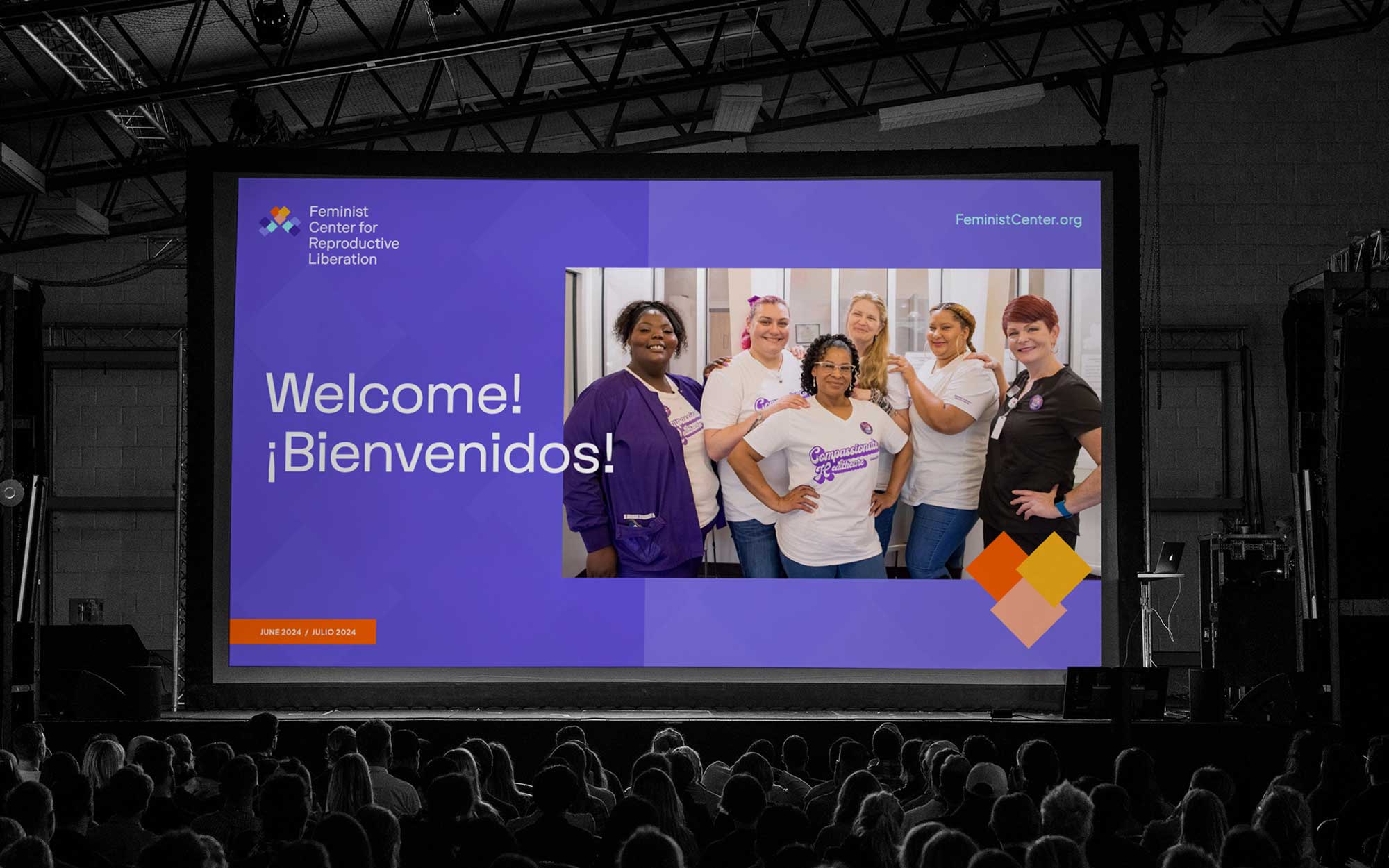
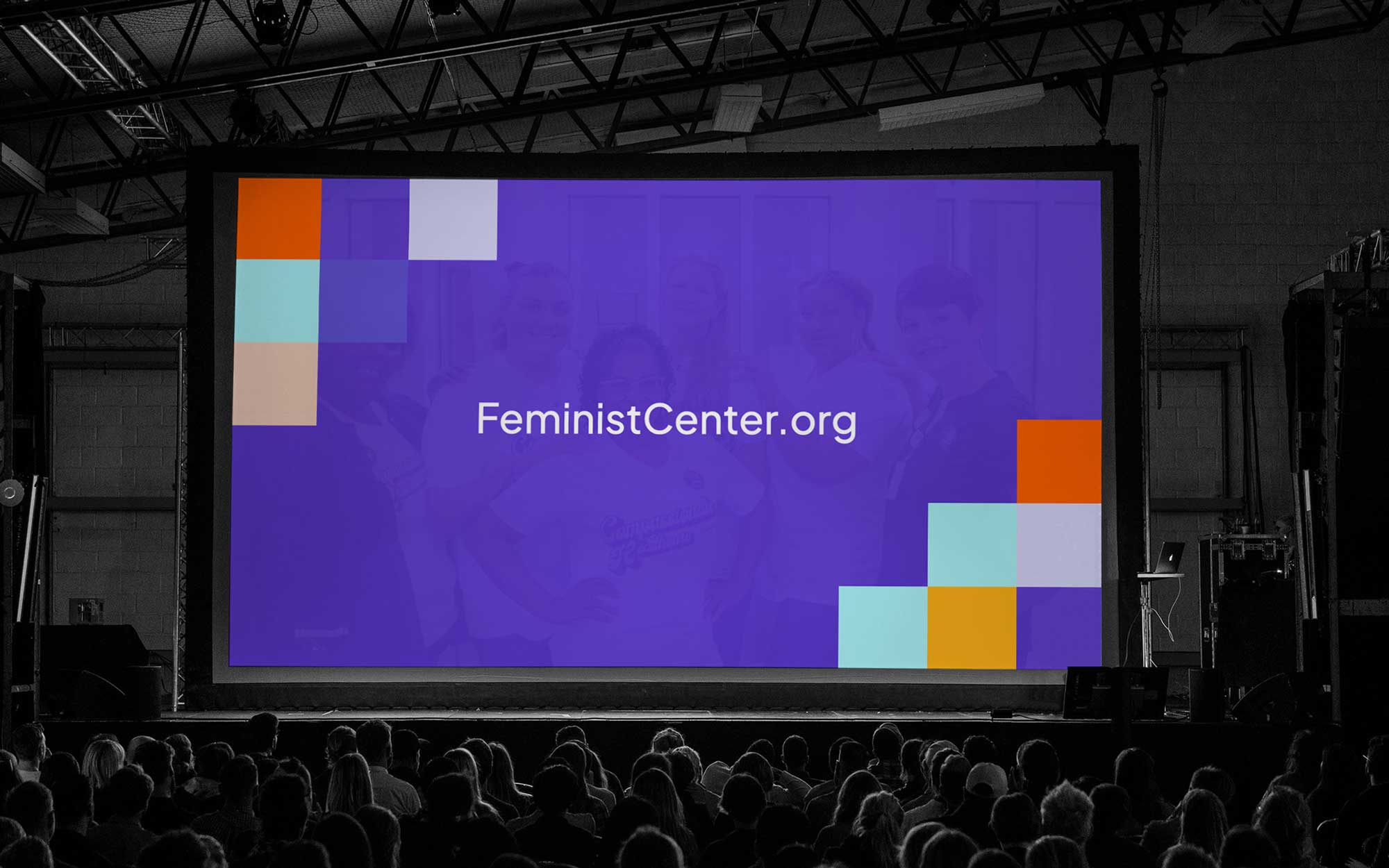
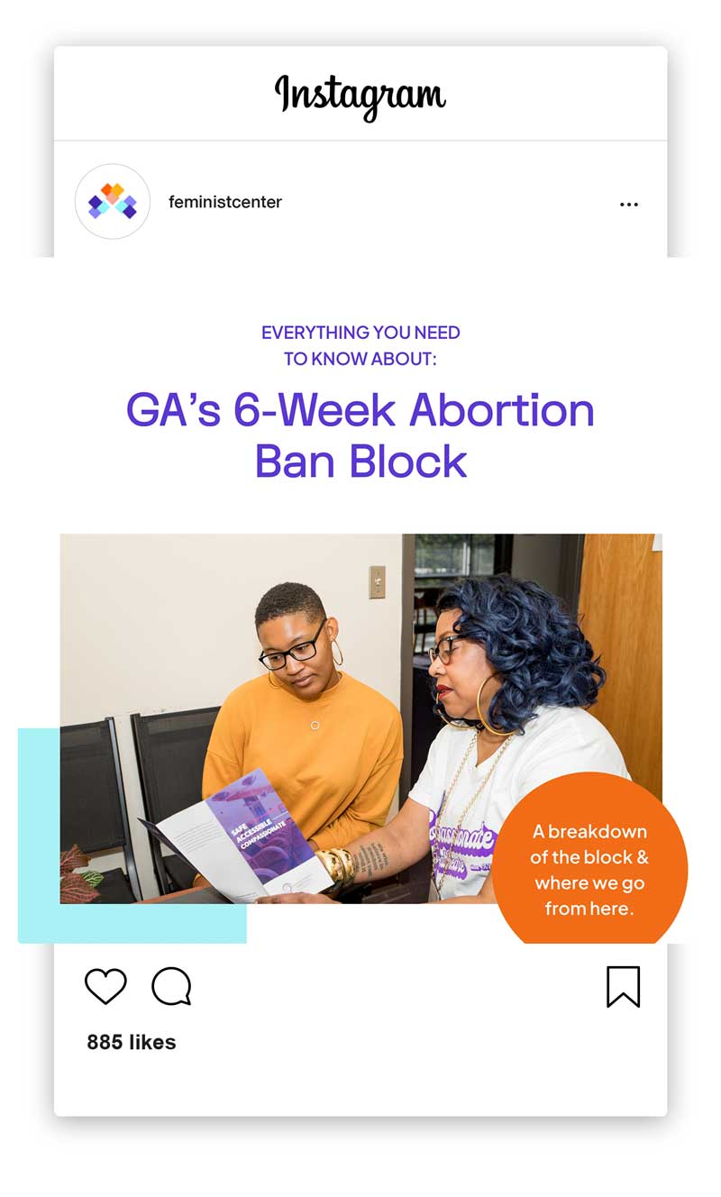
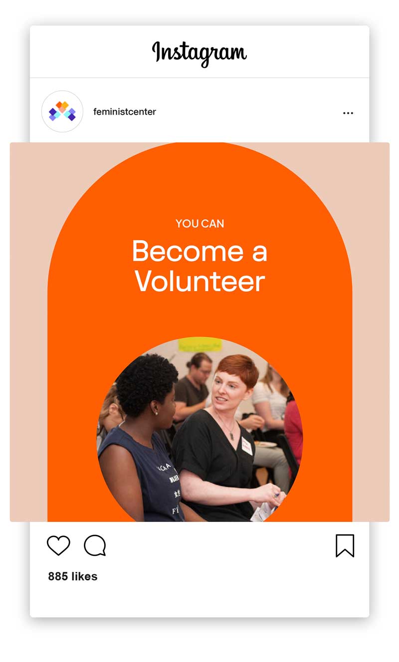
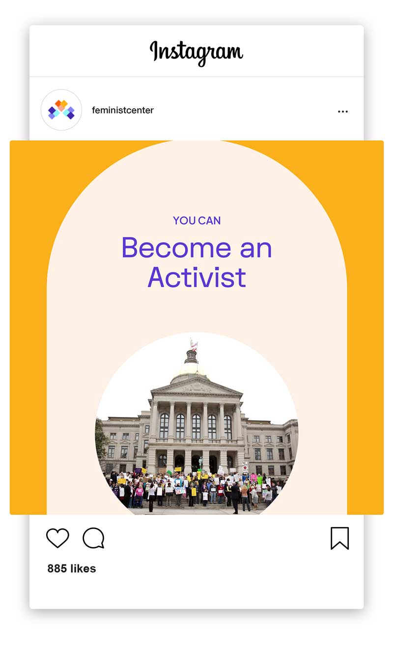
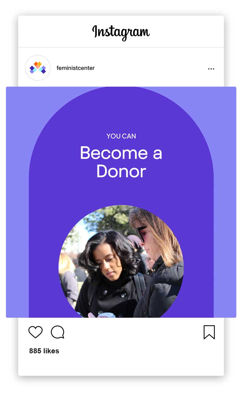
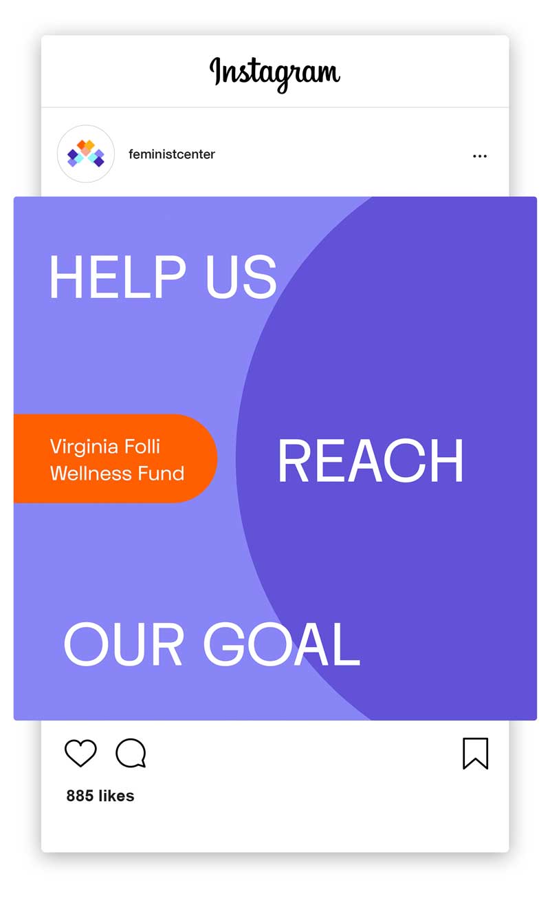
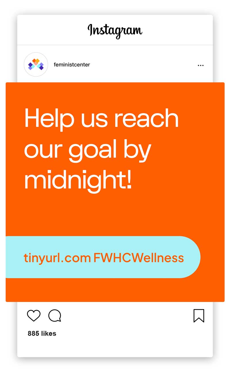
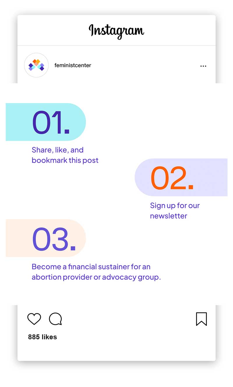
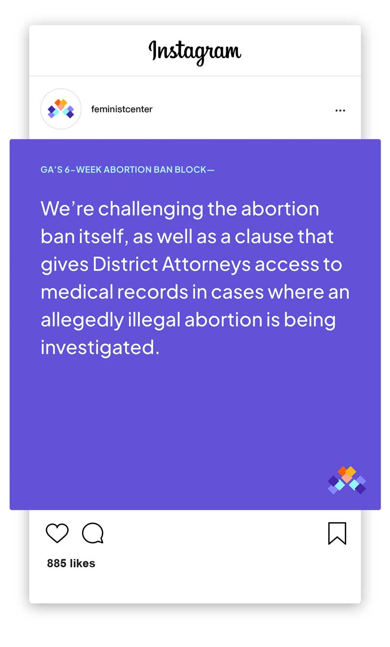
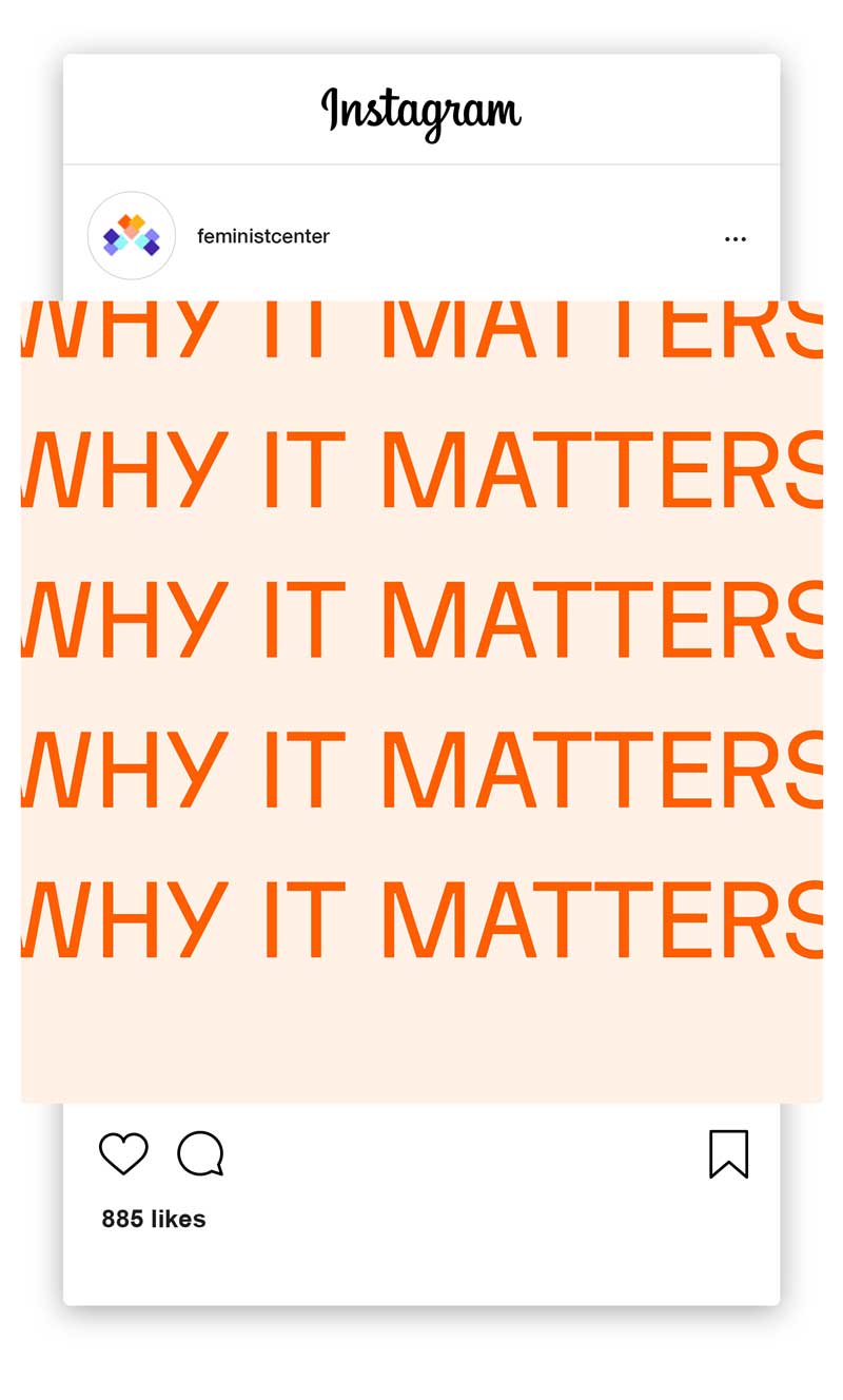
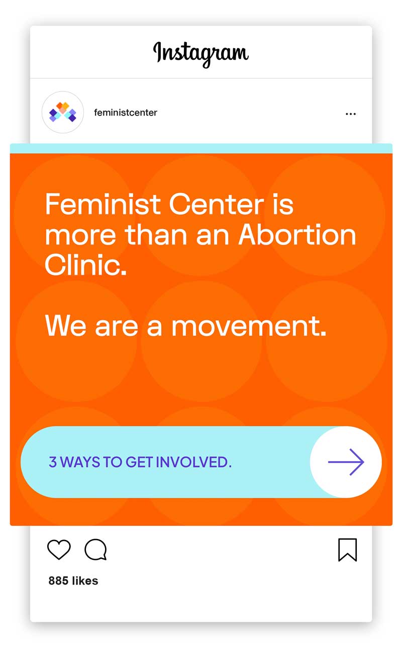
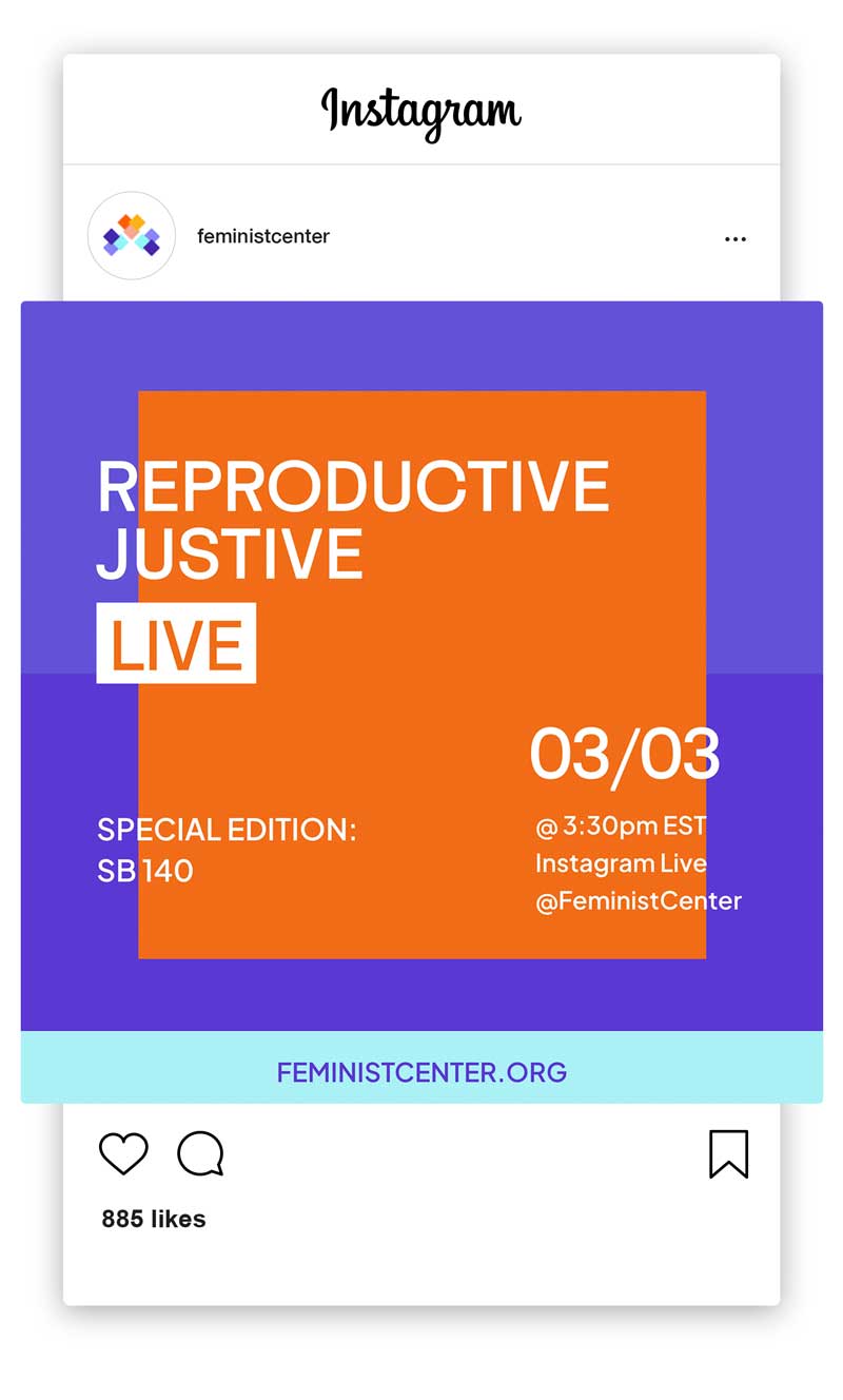
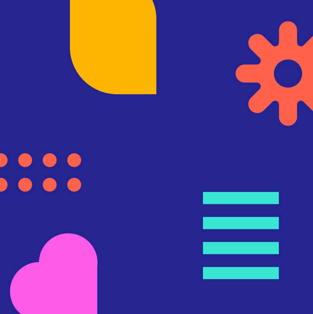
Visually, the brand balances warmth, inclusivity, and empowerment. Gender-neutral, joyful illustrations reflect the full spectrum of people served, while bold messaging inspires action. A vibrant color palette, anchored by a refreshed purple, radiates energy, hope, and care. The logo—three layered hearts formed by intersecting squares—symbolizes radical love, their three pillars (care, community, capitol), and their unwavering commitment to patient-centered care.
With the help of creative coprywriter Sarah Chung, we aligned the work the organization had done with a new name, messaging strategy, and brand identity.
Together with Sarah, we guided the renaming process—transitioning from Feminist Women’s Health Center to Feminist Center for Reproductive Liberation—a name that honors their roots while clearly articulating their broader mission: providing healthcare, building community power, and leading policy change. The name reflects their dual brand archetypes: The Caregiver and The Revolutionary.
Visually, the brand balances warmth, inclusivity, and empowerment. Gender-neutral, joyful illustrations reflect the full spectrum of people served, while bold messaging inspires action. A vibrant color palette, anchored by a refreshed purple, radiates energy, hope, and care. The logo—three layered hearts formed by intersecting squares—symbolizes radical love, their three pillars (care, community, capitol), and their unwavering commitment to patient-centered care.
IMPACT /
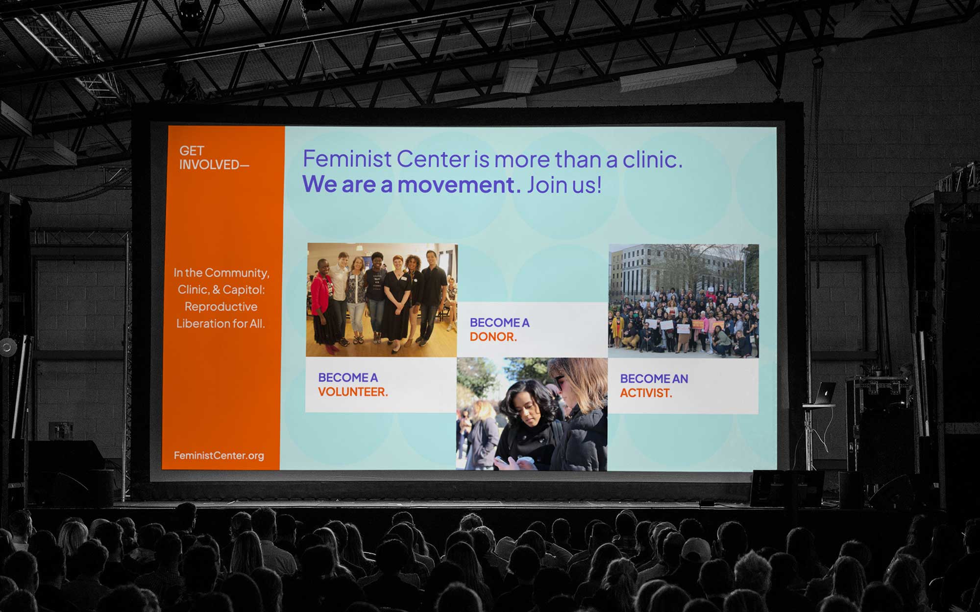
With a renewed mission, bold messaging, and inclusive visuals, Feminist Center now stands as both clinic and movement—a safe, empowering space that invites patients, advocates, donors, and partners into the ongoing fight for reproductive justice.
With a renewed mission, bold messaging, and inclusive visuals, Feminist Center now stands as both clinic and movement—a safe, empowering space that invites patients, advocates, donors, and partners into the ongoing fight for reproductive justice.
With a renewed mission, bold messaging, and inclusive visuals, Feminist Center now stands as both clinic and movement—a safe, empowering space that invites patients, advocates, donors, and partners into the ongoing fight for reproductive justice.

◆
In the Community, Clinic, & Capitol—Reproductive Liberation for All.
FEMINIST CENTER FOR
REPRODUCTIVE LIBERATION
◆
In the Community, Clinic, & Capitol—Reproductive Liberation for All.
FEMINIST CENTER FOR
REPRODUCTIVE LIBERATION
ORIGINAL NAME & LOGO
NEW NAME & LOGO

HEART
The concept of the heart stems from their mission passion for compassionate, loving, and inclusive care for all.
ABSTRACT HEART
BRAND SYMBOL—THE 3 HEARTS
The brand symbol is made up of three abstract hearts, representing the organization's three pillars (the three C's), where their mission and vision stem from.
In the Clinic: their work with their patients
In the Community: their community engagement
In the Capitol: their advocacy work

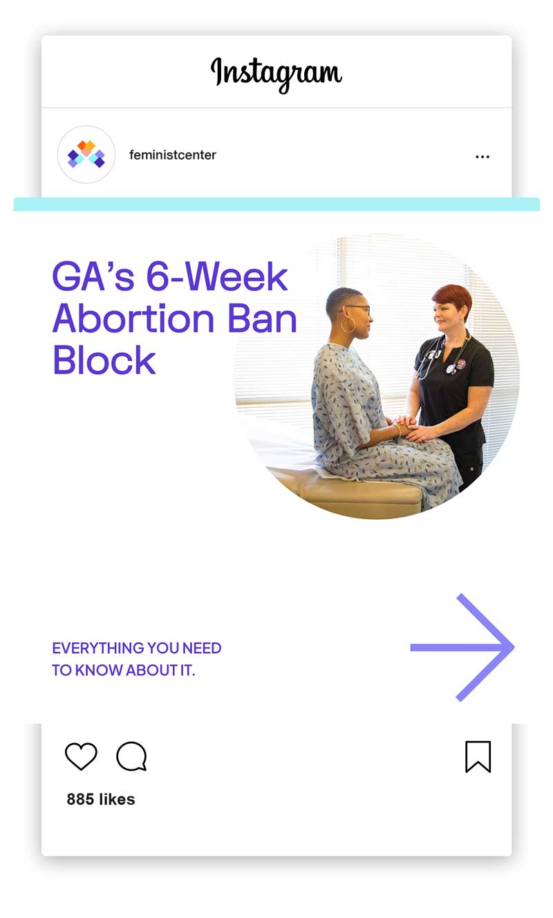
WEBSITE HOMEPAGE BEFORE & AFTER


Feminist Center for Reproductive Liberation is a Black woman-led, independent, non-profit, multi-generational, multi-racial reproductive health, rights, and justice organization. We are committed to a vision of accessible and compassionate reproductive health care and access for all who need it.
*
FEMINIST CENTER


“
CLIENT
Testimonial

ATLANTA
Georgia
KWAJELYN JACKSON
EXECUTIVE DIRECTOR, FEMINIST CENTER FOR REPRODUCTIVE LIBERATION
It felt a very natural turning of our theories and our language and our sentiments into something tangible.
KWAJELYN JACKSON
Executive Director
View Case Study ➔
It felt like a breeze to communicate. Donají understood and listened to us and incorporated what we're trying to share really effortlessly. It felt a very natural turning of our theories and our language and our sentiments into something tangible. I feel the most happy about the name coming together. That felt like it locked right into place and so everything else from there has just been a manifestation of that. I feel really pleased with the outcome.
MK ANDERSON
Director of Development and Communications
Website ➔
Donají nailed bringing all the feedback we had gotten from all the different stakeholders into key points for us to use that guided our visuals and who we are as an organization. Our new brand doesn't feel like a departure or like something outside of what we've talked about as an organization or what we've talked about with our base. To me that's the most powerful part. Everybody in the organization is really excited and loves the logo and understands the perspective that it's bringing. Getting that kind of consensus from so many different types of people in our organization I think is the thing that I'm probably most proud of.
In describing ourselves as "reproductive liberation" felt really clear for us, it made sense. Yes, this a new element we're adding to thinking about the future and the vision. That made it feel like although we were exploring something new, it still felt familiar and grounded in our values and our vision. Donají really set the standard for what it should feel like to work with a consultant.
+ CASE
STUDIES +


•
LET'S WORK
TOGETHER
READY TO PUSH BOUNDARIES,
MOVE HEARTS, & SHAKE THE WORLD?
Get Started with
The Brand Magic
Workshop

◆
UNAPOLOGETIC BRANDS FOR UNAPOLOGETIC HUMANS
FOR FOUNDERS ROOTED IN UNSHAKABLE VALUES
◆
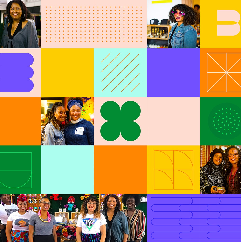
Brand strategy, branding design, and website design for women of color entrepreneurs, founders, leaders and BIPOC-led organizations in the Bay Area and beyond.
Latina-Owned / Veteran-Owned
© Donaji Mejia 2025
